Introduction
|
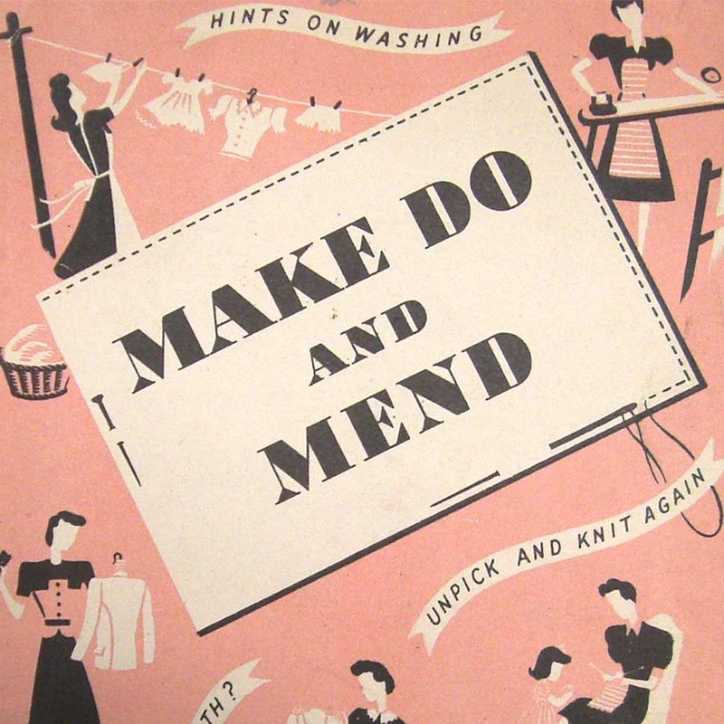
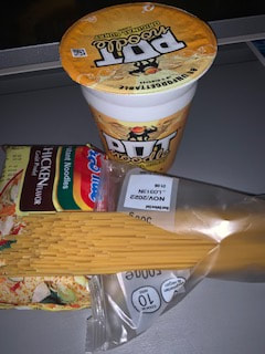
In photography we have started a new project called "MAKE DO AND MEND" we decided to do this because COVID-19 has limited our using space and resources. So now we have made this new project so we can make do with what we have because we cant use the dark room or go outside and walk around our school premises and take photos like we usually did. "MAKE DO AND MEND" is helping us learn to limit our resources so now he school has also brought tripods for our phones furthermore we are using out tables as our own studio so now this is where we take photos and do all our projects now.
|
Artist Research
Collage Appropriation
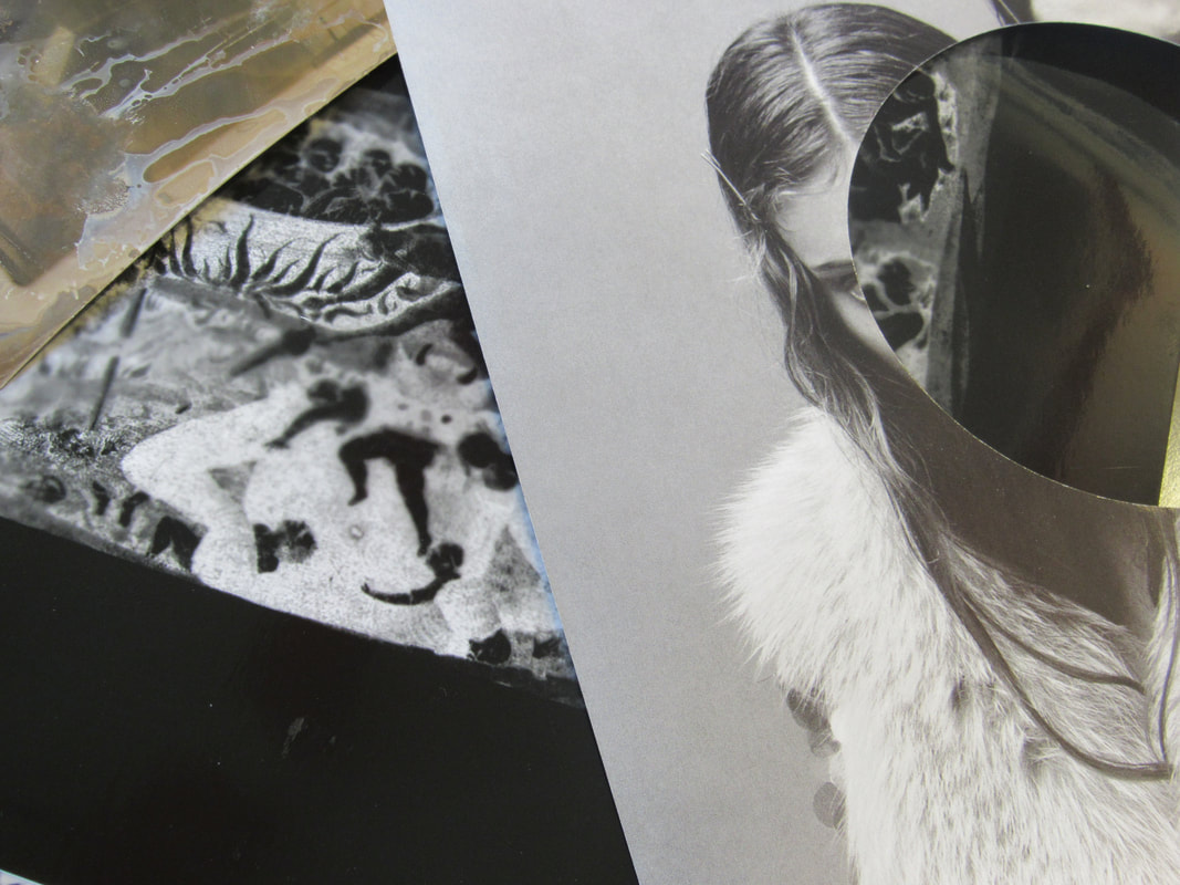
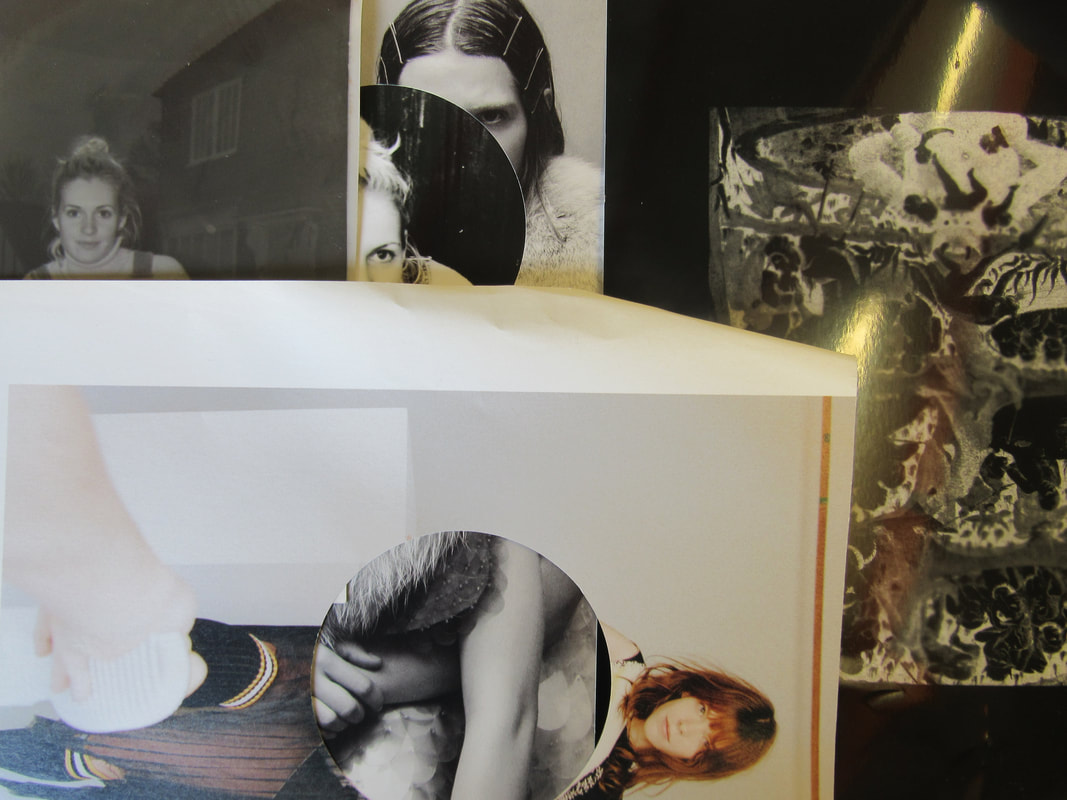
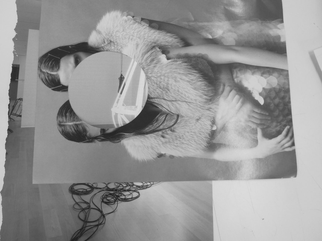
Anna Lucas & Alice WaltonI watched this film by two artists collaborating on an exhibition. No-one could visit the show because of the Lockdown so they shared their work online. I liked the split screen effect so tried to make one of my own using iMovie.
|
|
Split screen video
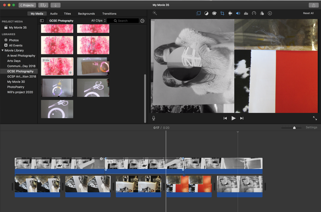
WWW:I managed to make multiple examples of collages. Used evidence to tell you how to edit my video and even made a split screen video.
|
EBI:I added all my collages and got videos and pictures of how i did them.
|
Duchamp ''Readymade'' Response
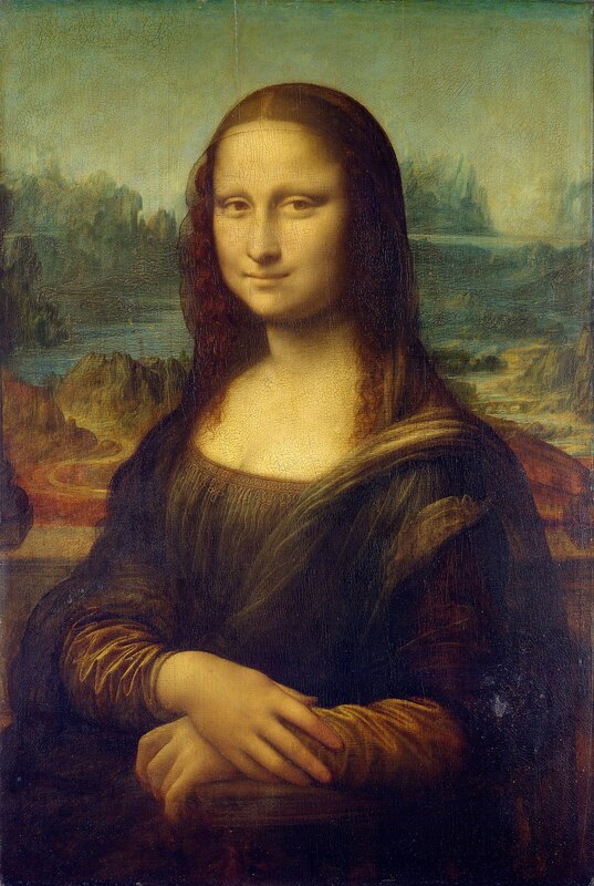
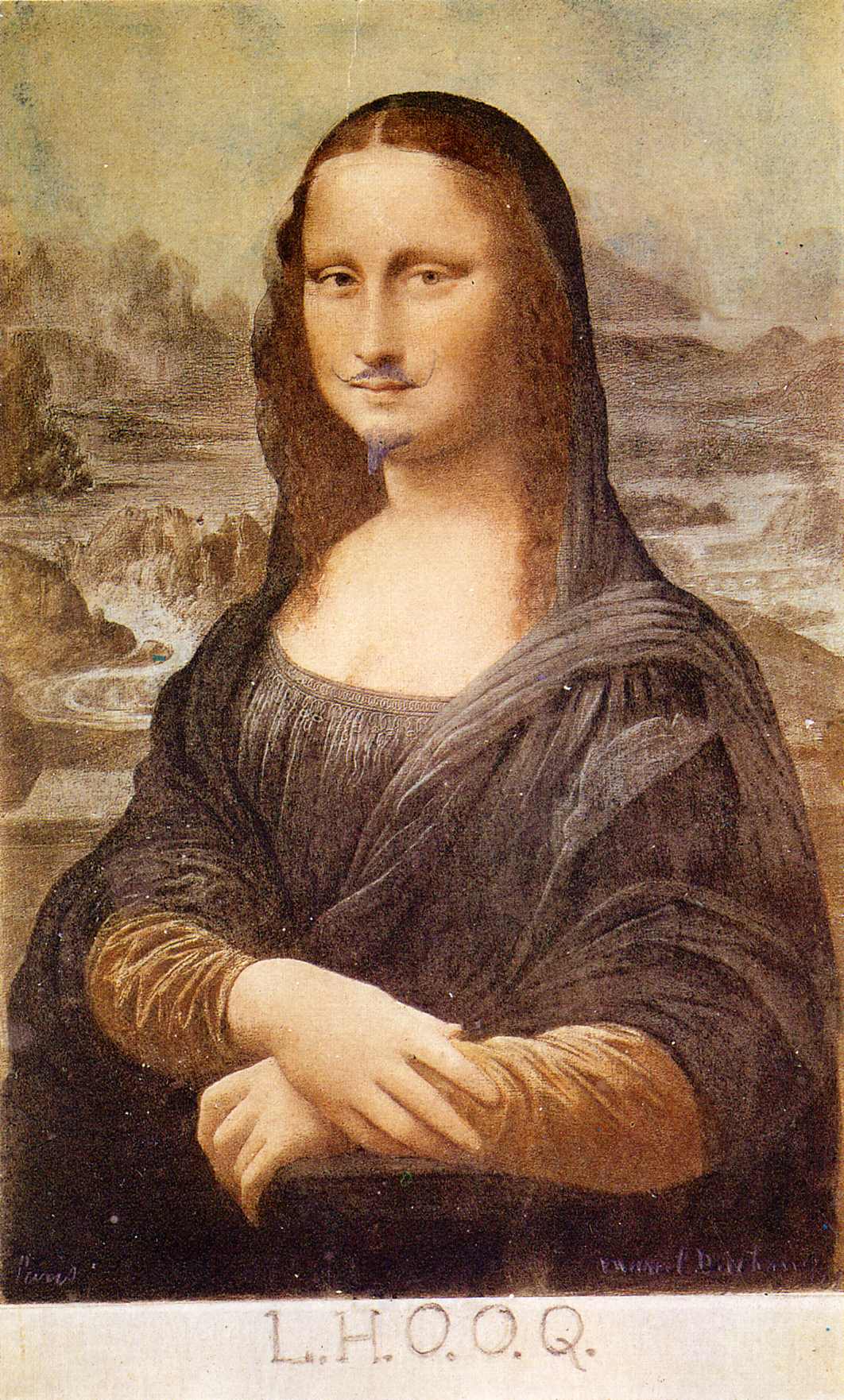
The Mona Lisa is so famous because the appeal of her smile Da vinci aim was to exploit an optical illusion to create a unique smile through perspective and use of shadow work. The title means ''Elle a chaud au cul'' or ''She is hot in the arse'' or ''She has a hot ass''. He added the facial hair and combined the title together to describe he's love for wordplay. Readymade suggests made to a standard size or specification rather than to order. In this case it involves taking a mundane object (a postcard) not generally considered to be art and transforming it by adding pencil marks and renaming it, placing it in an appropriate setting (like an art gallery).
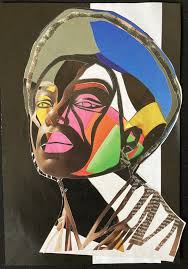
Sharon Walters.
Walters is a London based artist who creates hand-assembled collages celebrating black women. The pieces use magazines & photographs & are inspired by botanical natural beauty & urban scenes & the beauty of natural hair. She has been working on a project for about 2 and a half years called 'Seeing Ourselves' consisting of around 250 pieces, mixed media pieces. It explores identity, western beauty standards & afro hair. She creates hand-assembled collages using photographs almost daily as a way to be present, reflective & mindful.
Her Work
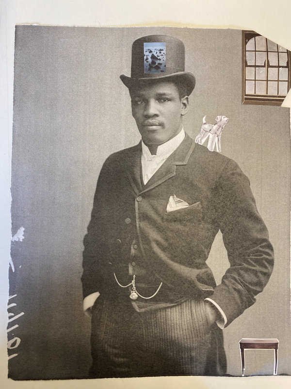
My Readymade Images
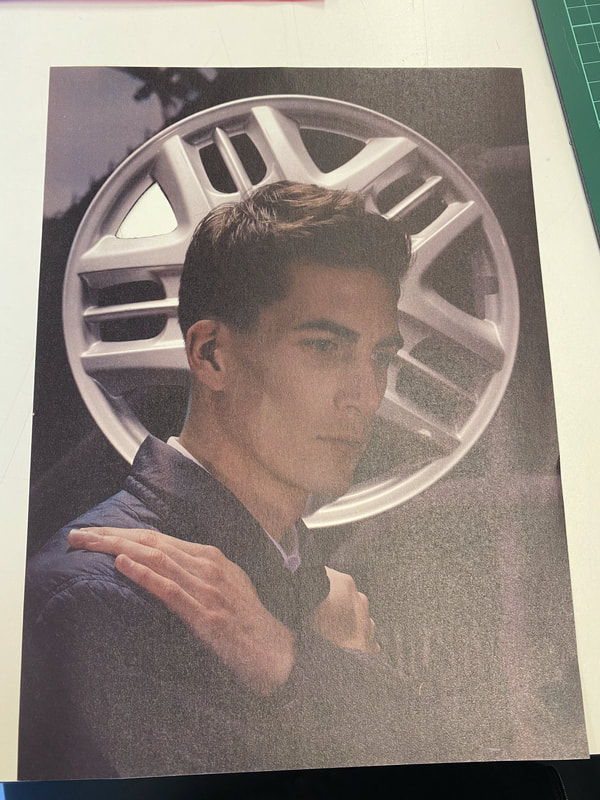
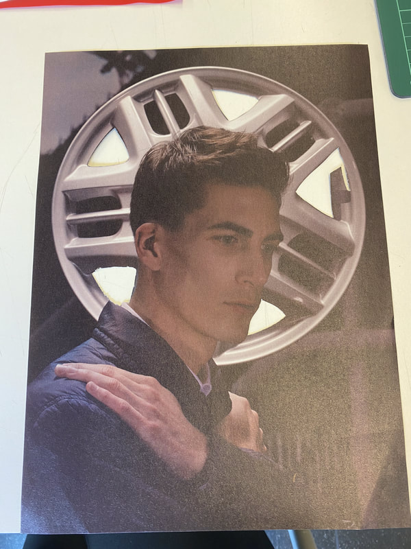
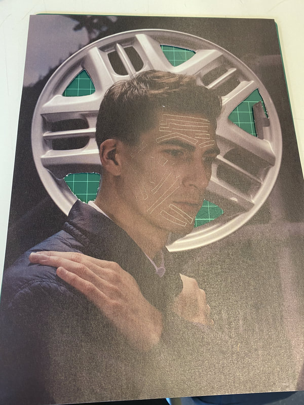
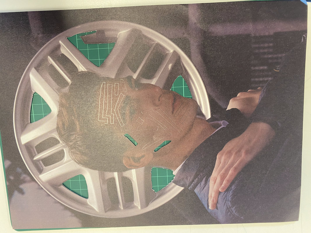
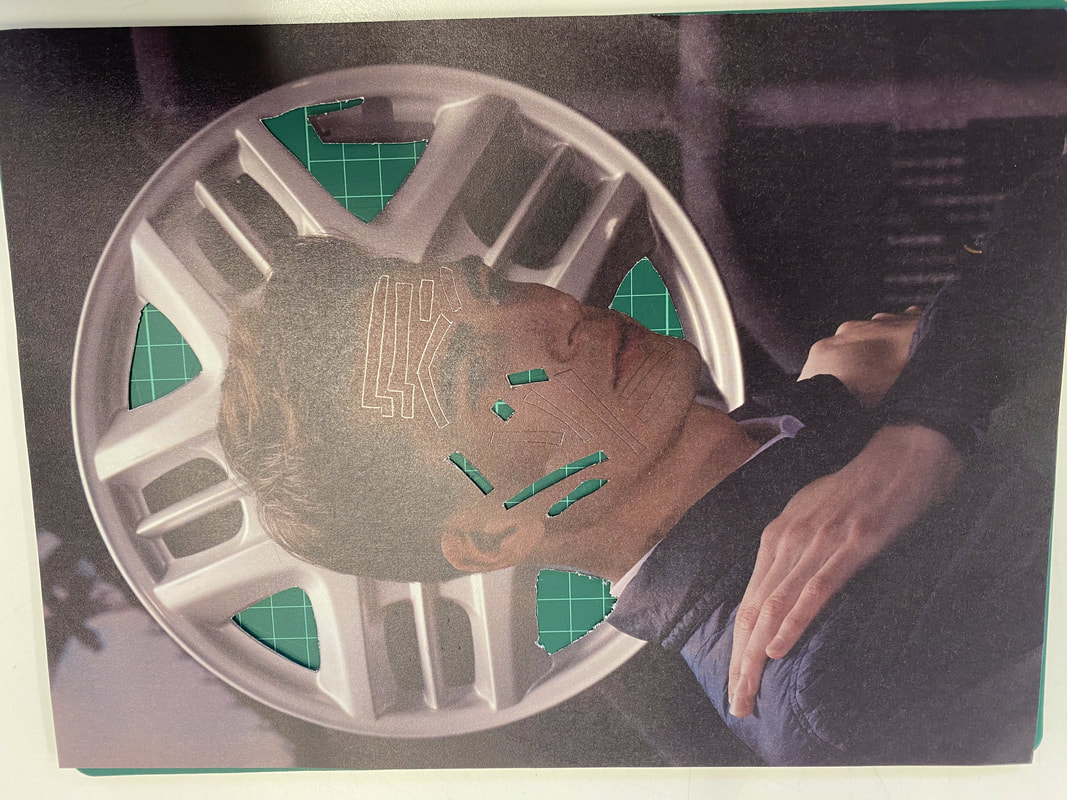
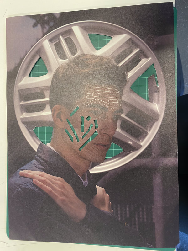
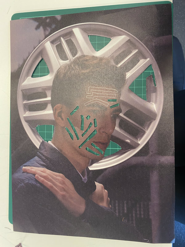
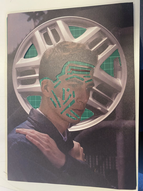
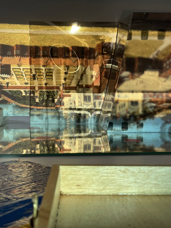
Hannah Höch's Beautiful Girl
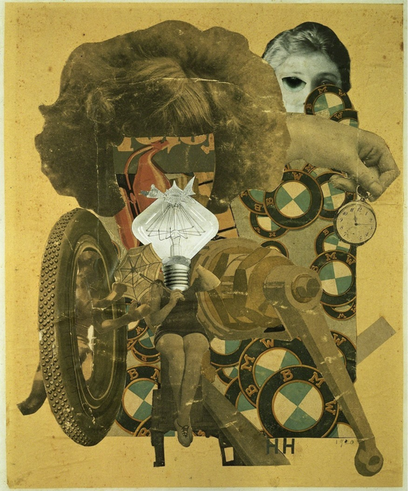
There's a lot going on in this picture. I can see a lot of yellow in this collage and every object has a yellow tint. This collage title has 'girl' in the title and there are different parts of a girl's features scattered throughout. For example, there is a big hair do and beneath it what looks like the girl's body smaller in proportion to the large hair piece. Furthermore, I spotted some everyday objects in there like the light bulb and the pocket watch being held by a single hand on the right. I also noticed that some things have been placed to resemble something that's missing like how the light bulb is being shown as a head and been slotted just perfectly in between the shoulders and even the pattern underneath the hair is resembling the facial features of someone.
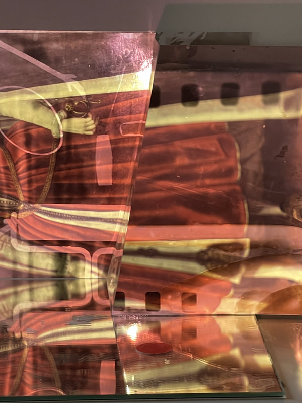
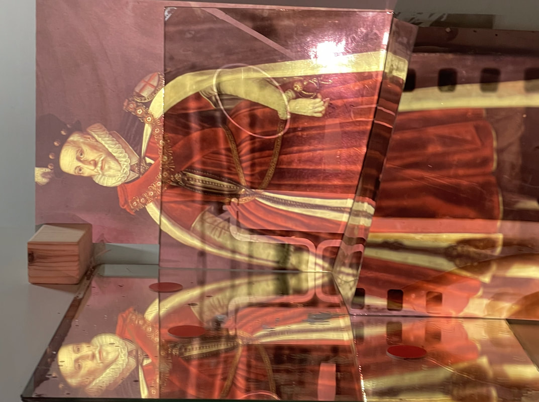
In this picture I can see 2 types of objects. The first thing I can visualise is all the old BMW signs scattered mainly on the right side of the picture and i really don't know why because the title of this picture is 'beautiful girl'. The second thing that caught my eye is the big hair but a tiny body. This almost creates a whole person. The last thing i saw was the big wheel to the left of the image which links back to the BMW signs , like the car is being broken into bits. Maybe the 'beautiful girl' uses theses objects in her day to day life. Maybe she drives a BMW, or she drives a bike or something. Maybe she even works somewhere to do with clocks. Maybe she's always surrounded by clocks or the noise of a pocket watch could have many meanings behind it.
I think the artist has chosen the title 'The Beautiful Girl' for a reason, but I personally wouldn't call it that because there isn't a clear visual of a single girl looking beautiful. I would name it something like 'The missing beautiful girl' or 'yellow girl' because 'The missing beautiful girl' is linking back to their being a beautiful girl in there but she's missing because she is in all areas in the picture and you must piece her together to discover her but also 'yellow girl' because of how much yellow is presented in the image.
I would choose the following three adjectives to describe this image:
- Confusing, because i seriously don't know what this image is trying to portray
- Sandy, because it looks kind an off coloured type of sand
- Vintage, because everything looks very dated and slightly discoloured
- What has the image and title got in common?
- Why is yellow the main colour?
- Is the girl truly beautiful?
Feedback
Do I have a theory about what the image means?
It is suggesting women's independence of when the men went to war when they could be free and independent and start to not rely on men as much as they did. They could finally do things in workplaces more advanced like working in a factory industry or in medical departments
for the men who were injured during the war, not just being a house worker or looking after children then can finally see what a big wage was?
What might Hannah be saying about he position of women in 1920's German Society?
That during the war women started to get more freedom and less control from the men and government about what they do, where they work, where they can go out to with being unaccompanied by men or their partners and how women progressed over the years.
What is the link between girls and cars?
Because they use to advertise cars by having the car and a half naked woman to catch the eye of men because men back then used to think because women are so curvy so should our cars and even name their cars girls names just to have the pleasure of having that car.
Why is the stopwatch so important?
Because, a stopwatch is representing time and , in this case, it could be implying of how long it took for women to gain independence over the time periods.
3D > 2D > 3D > 2D
Matt Lipps
Matt has spent past decades really focusing on the relationship between sculptures and photography. His constructions on photographs rely on collage strategies, sculptural tropes and theatre staging techniques. Matt work consists of uses cut-out images that he finds in discontinued photographs and magazines, arranging the images to create still life photographs. Then he photographs these images/scenes using a large format camera.
Daniel Gordon
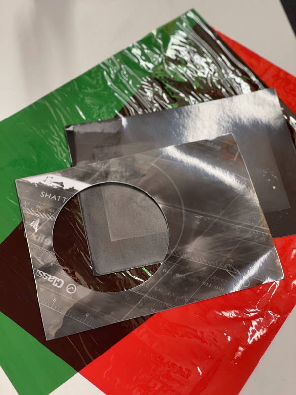
Make Do & Mend Assessment
Making Day
Selecting Images.
|
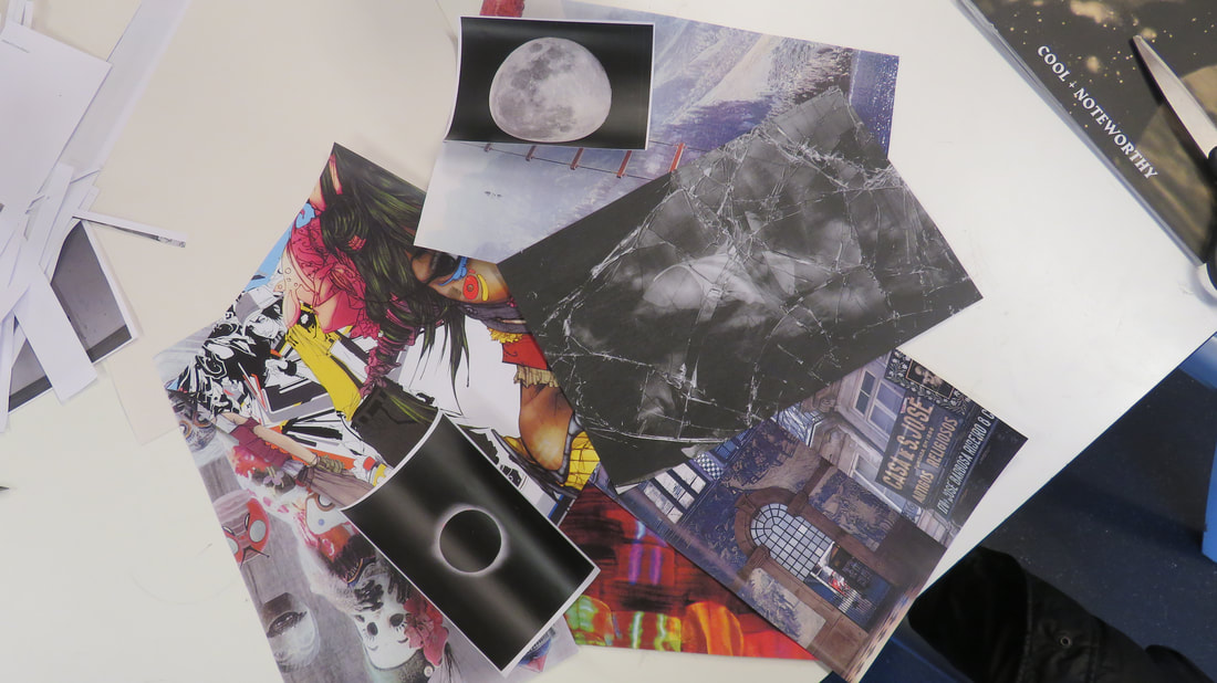
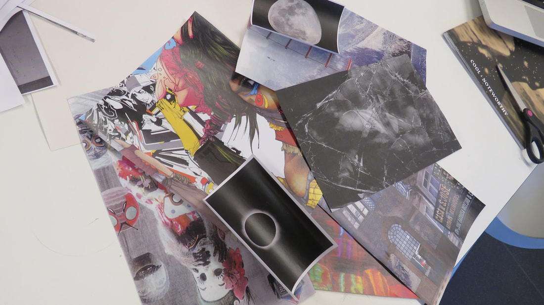
Firstly, I chose a selection of black n white & colourful images from the magazines and photography books provided in the lesson from photocopying the images in either black & white and colourful setting on the photo copier.
|
|
|
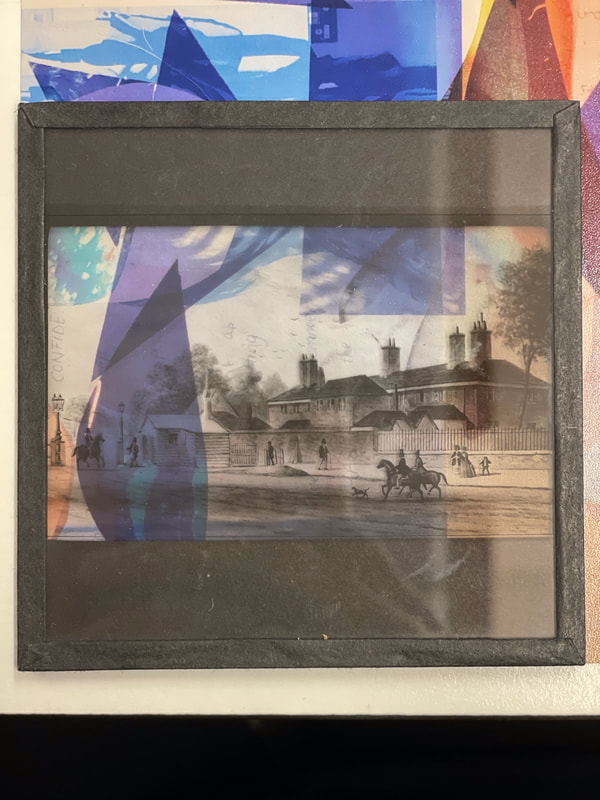
I then separated the images into 2 groups of black and white and colourful. These are the colourful images i selected and worked with them to make one of my final pieces.
|
|
|
For my 2nd piece i selected the images that where black and white and moved the images around till i was happy with the outcome i made.
|
|
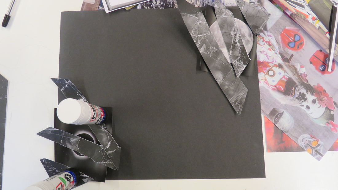
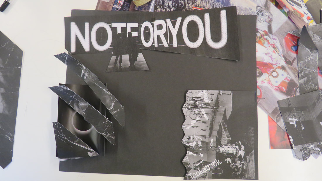
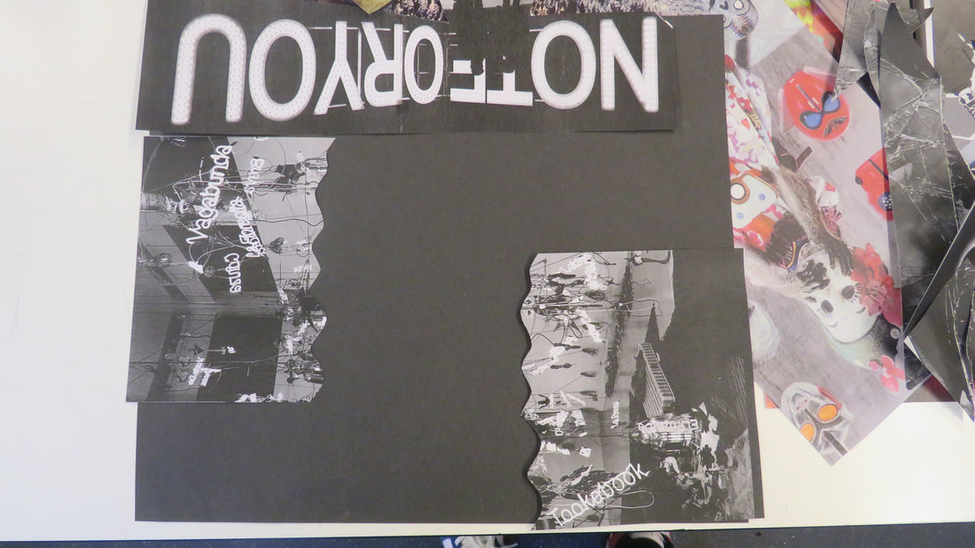
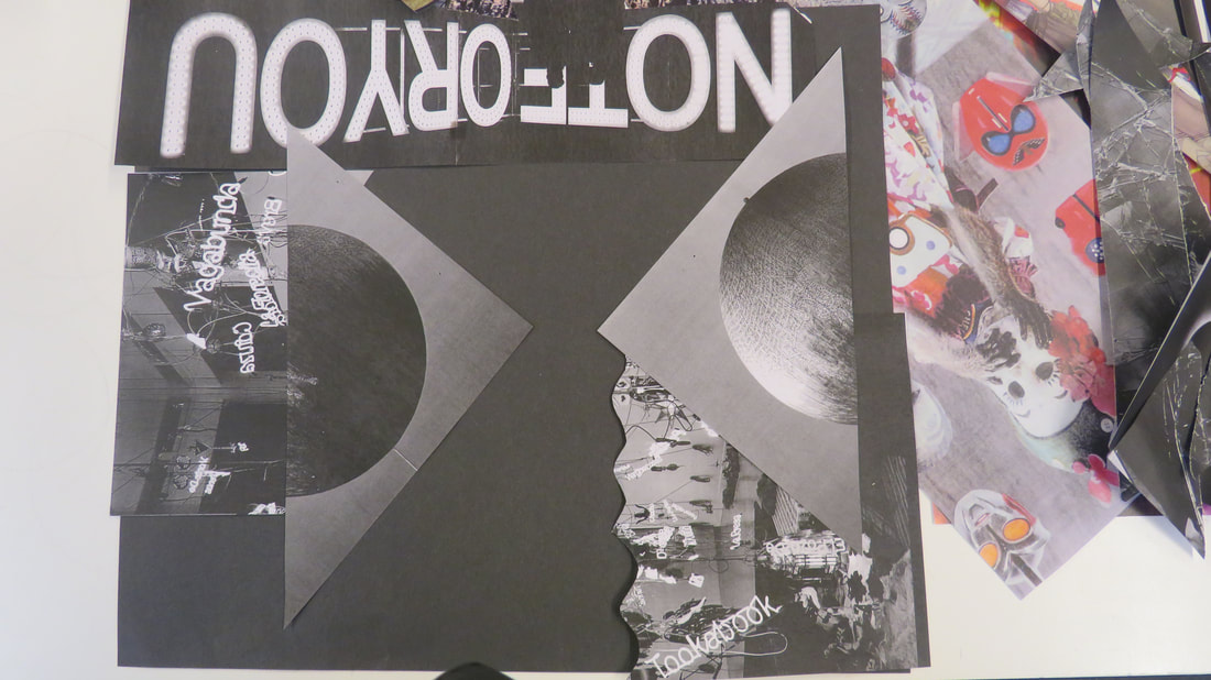
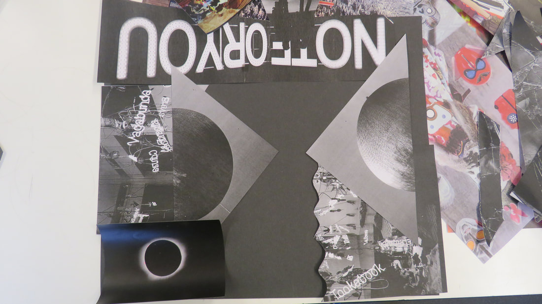
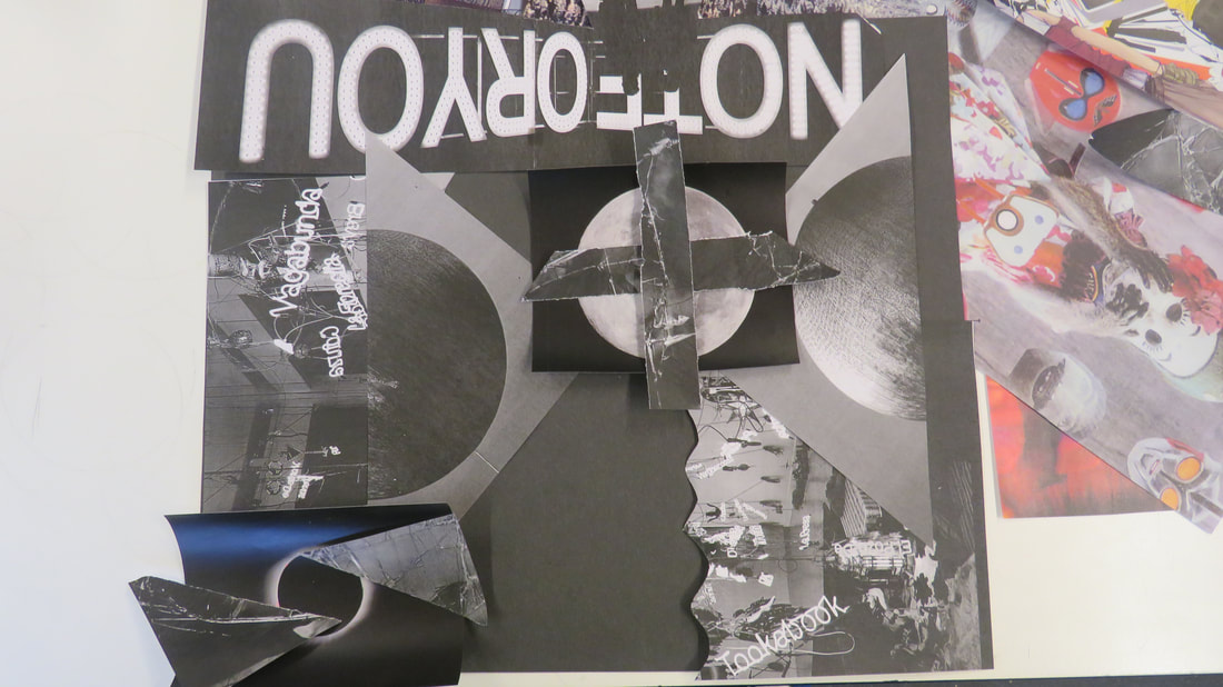
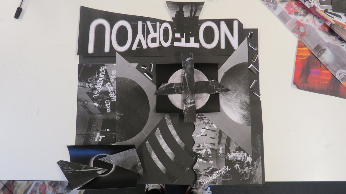
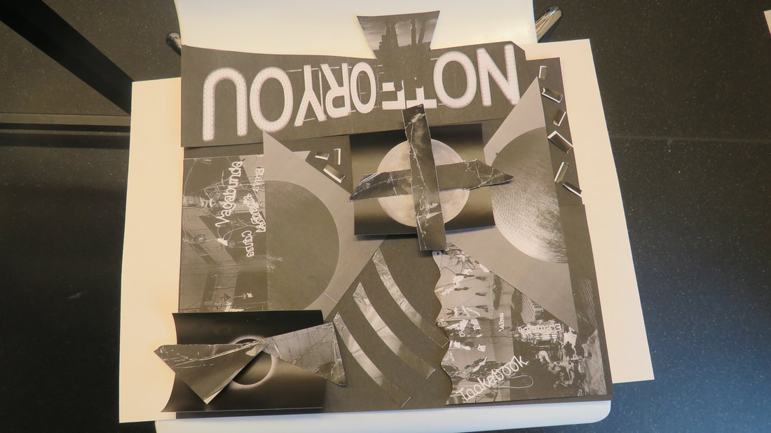
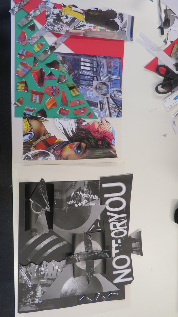
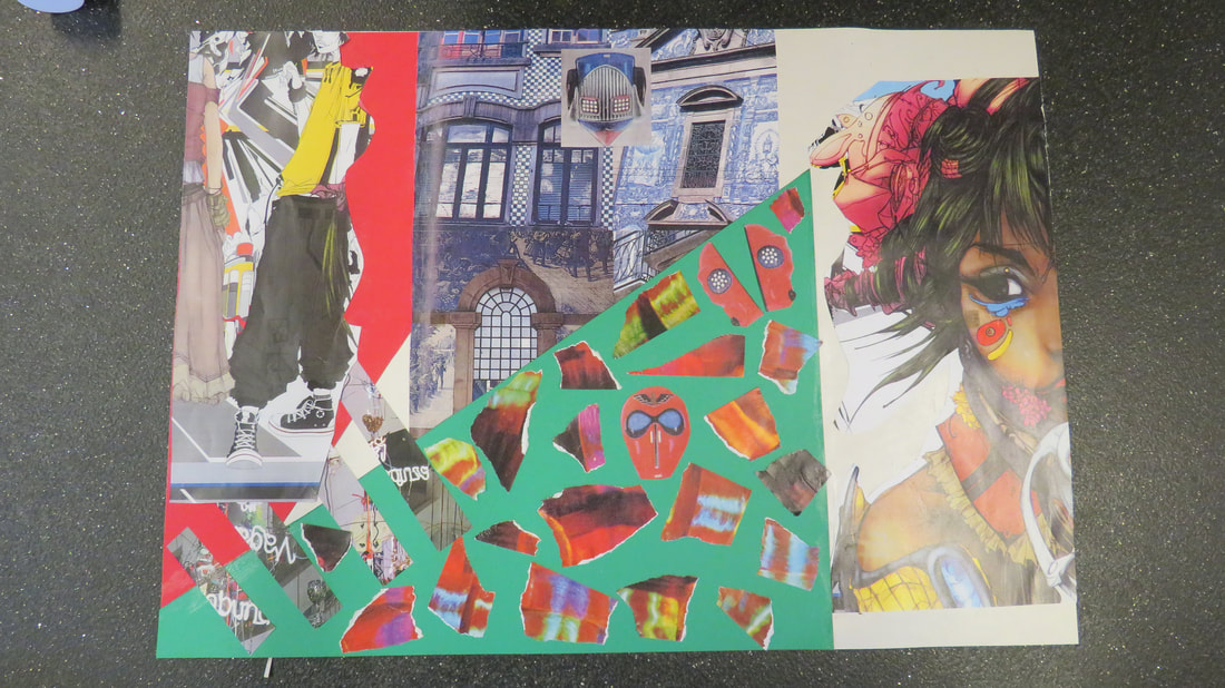
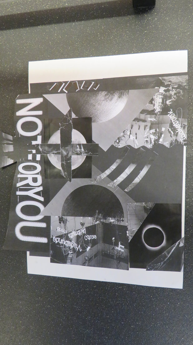
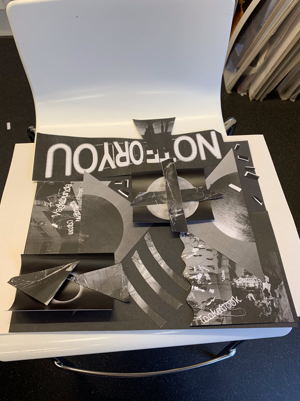
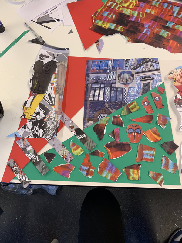
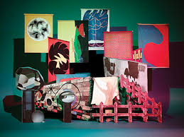
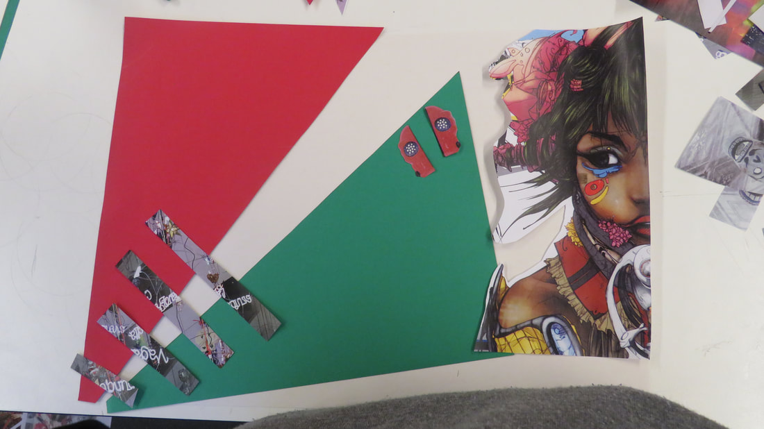
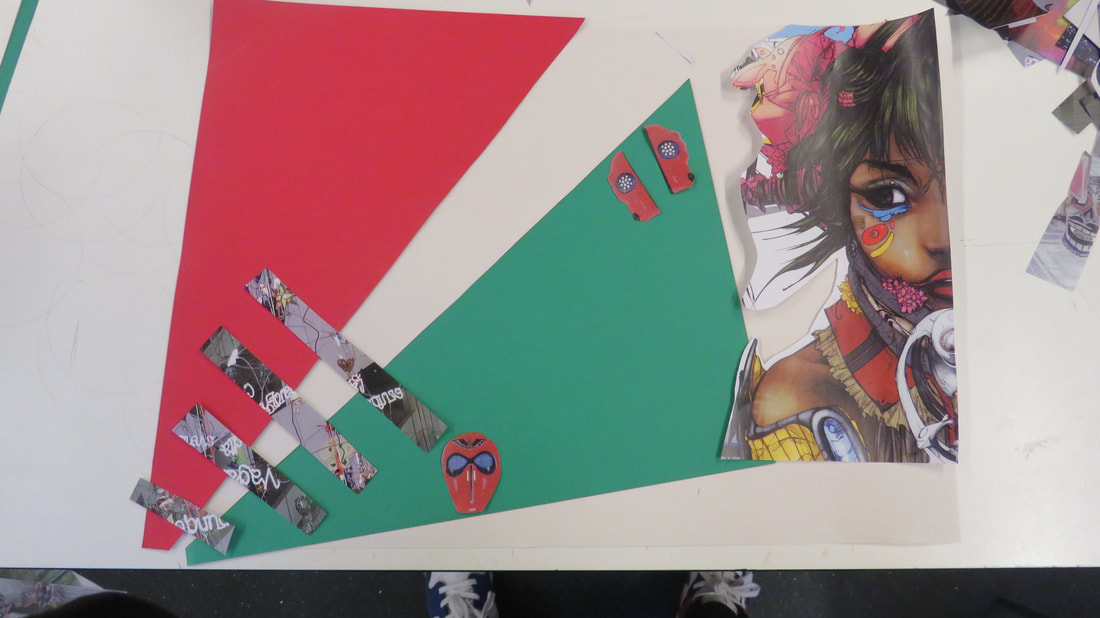
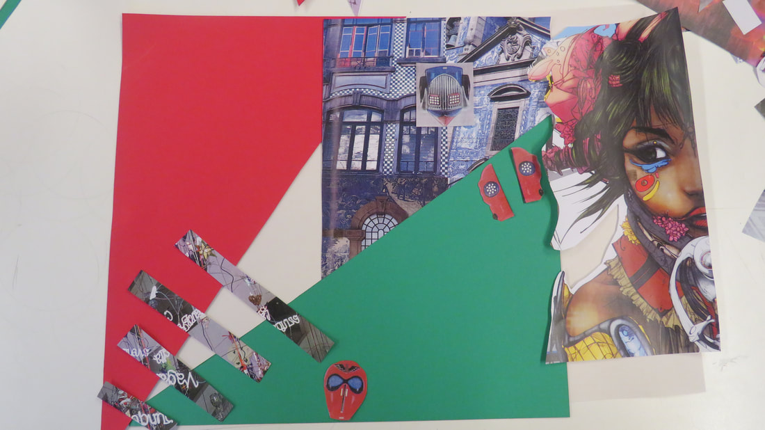
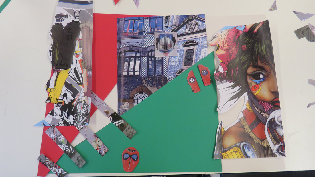
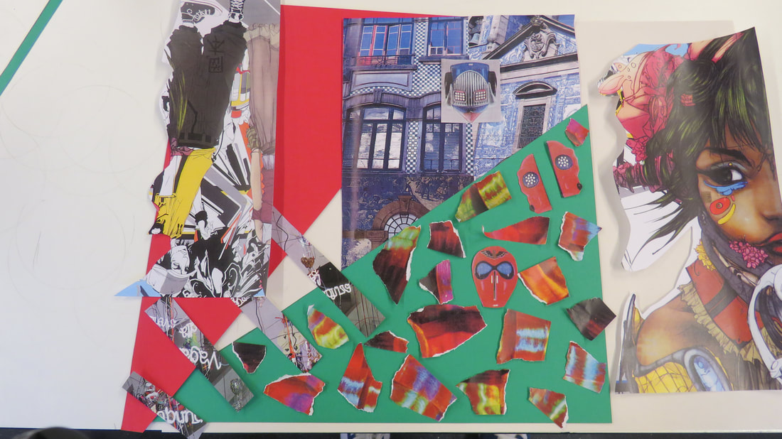
These are my final pieces. I made 2 collages with different themes one black & white and one with a very colourful and vibrant colours.
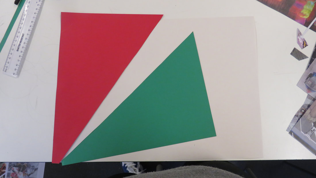
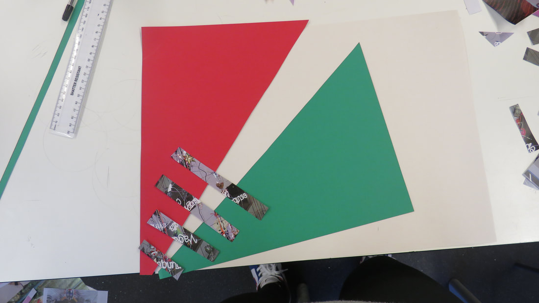
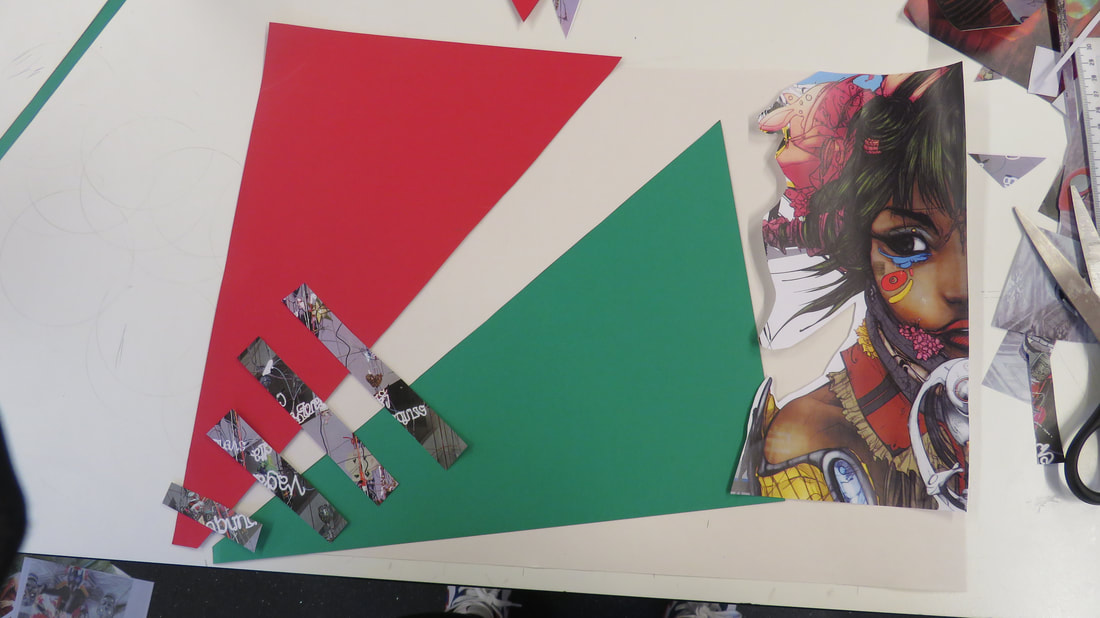
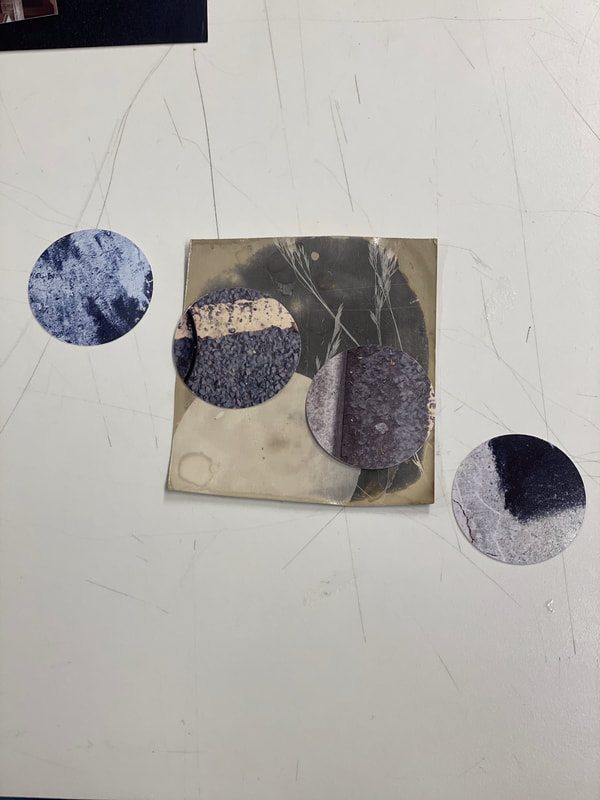
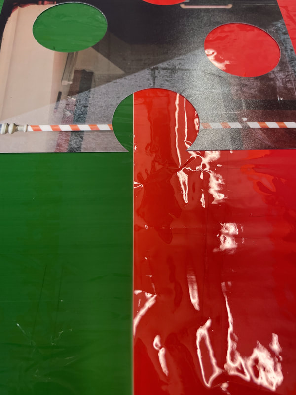
These collages theme is what i was working for from the beginning i wanted 2 collages with 2 different outcomes and that is what i received, I was hoping to create 2 very different collages in the amount of time i had. With the black and white collage I used a rang of photo's and cut them out and mounted them onto black card. I made some of the elements upside down to make it as abstract as possible. I want people ot view it as a dark image, dull coloured and mysterious and different. So people can infer that life isn't as good as it may seem on the outside. With the coloured collage I got images anime themed, some from a book, I ripped up some of the images to add a different element to it. I mounted it onto green and red card. I think they were both executed successfully, I prefer the colourful one more as it represents my personality best and it's different and bright and it stands out, like me. I based them off of my main two moods. Mainly bright, happy, the life of the party and also dark and sometimes quiet, reserved etc,
If I had more time I would've liked to have combined them both to make a third one, to make it different. I would've also liked to have made it more abstract. I wanted to add more elements to them both however I used the resources I could. I used the habit, persistence most. As I had up's and downs along the way and it was a bit stressful however I stuck through it all and was determined to make two collages as best I could in the 5 hours I had. I had many different ways of laying out the photographs however I think the ways I chose fit the theme best.
Prison Photography
Klavdij Sluban's photography workshops with juvenile inmates
|
|
This photographer's work really interests me because he has a real passion for photography. When he's in the jail he makes a good connection with the prisoners, even calling them his "students". He behaves "according to life" and lets the prisoners know that he's not sneaking around and trying to show something they don't want shown. It's interesting that he only works with teenage prisoners because he says that it's therapeutic for them to take pictures of themselves. Sluban's good connection with his students means that he can really push them into their artistic, creative "extremes" which they "love". He doesn't pull their leashes in the way the prison authorities do but allows them to be pushed into a BIG world of creativity. He interests me because of the way he views prisons and the way he interacts with prisoners.
|
Nicoló Digiorgis' 'Prison Photography' book
This book is a collection of pictures taken in an Italian prison. The artists held workshops with prisoners, encouraging them to learn about photography genres by making pictures of their surroundings. It must have been very hard for them to make Travel pictures, for example, but they find interesting solutions to the restrictions they faced.

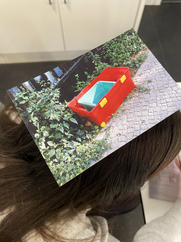
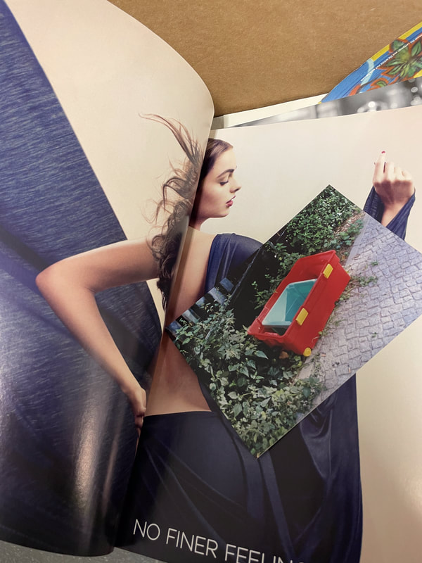
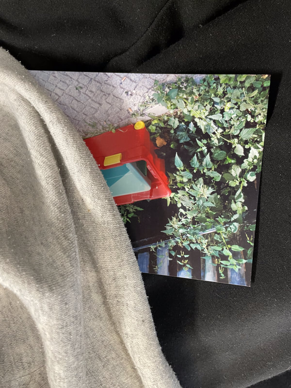
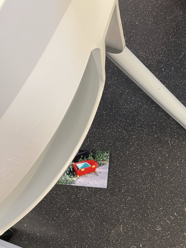
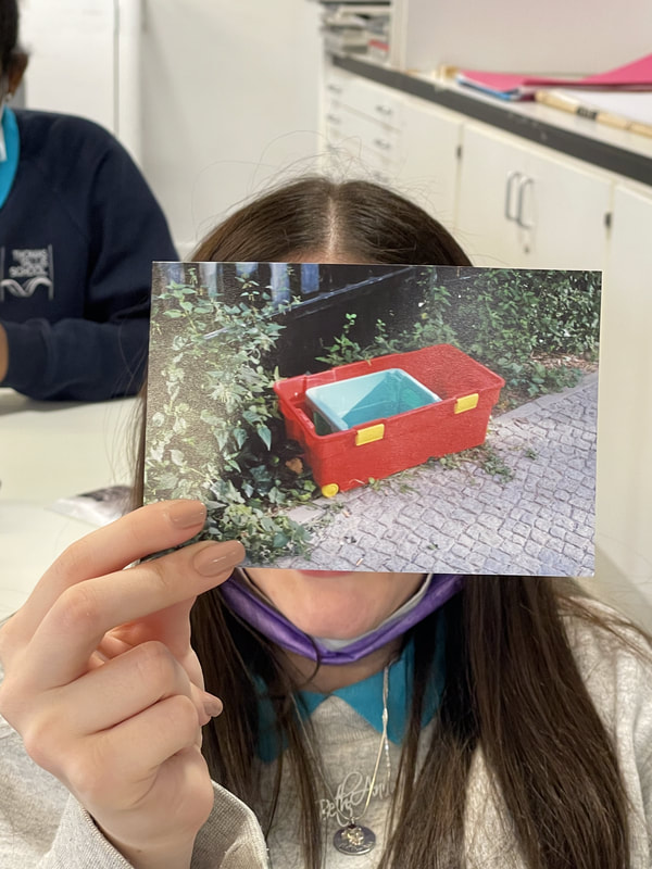
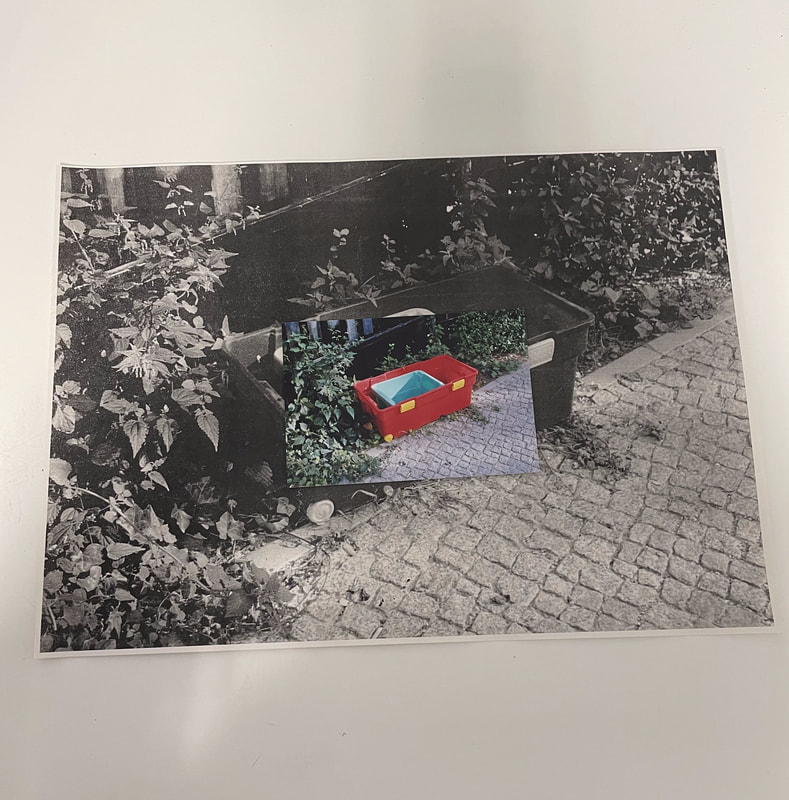
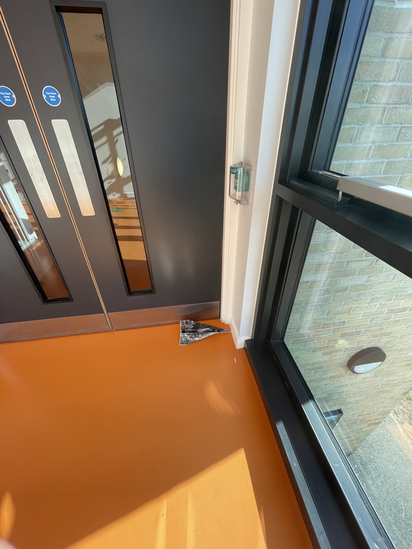
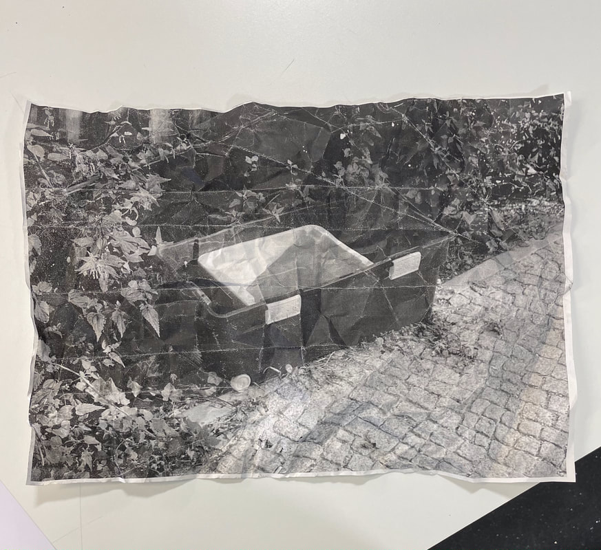
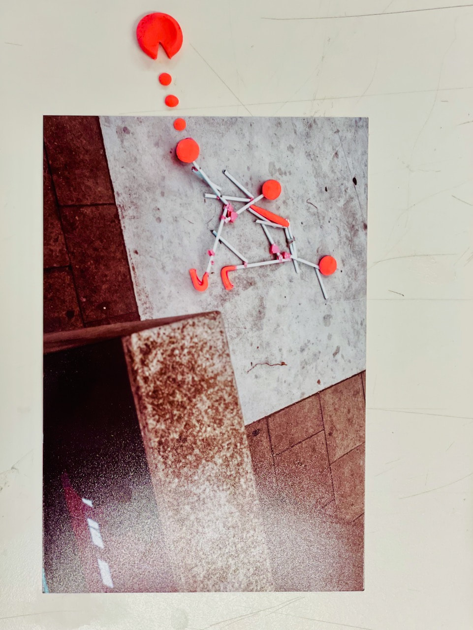
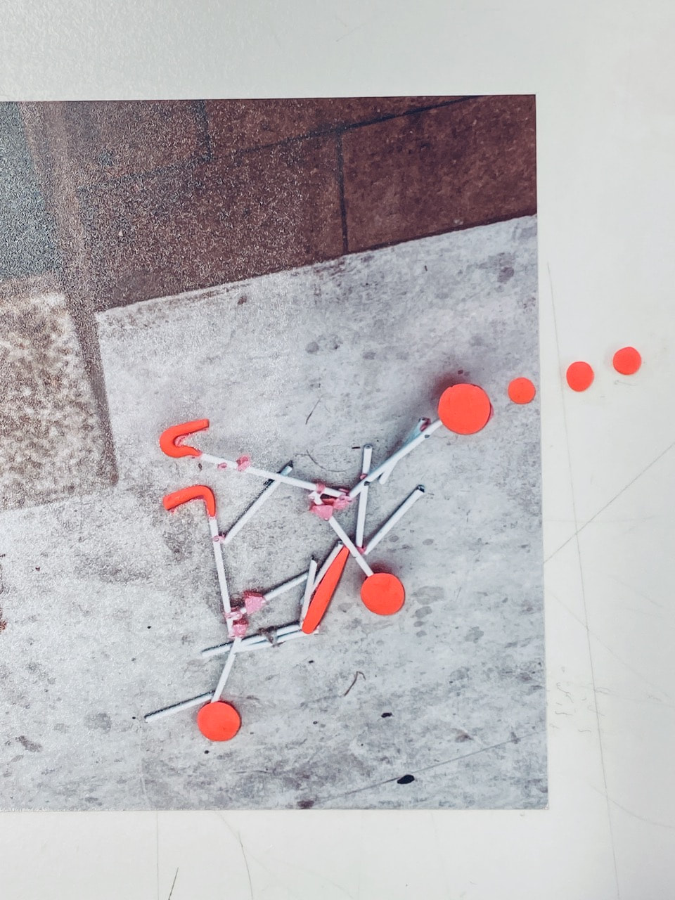
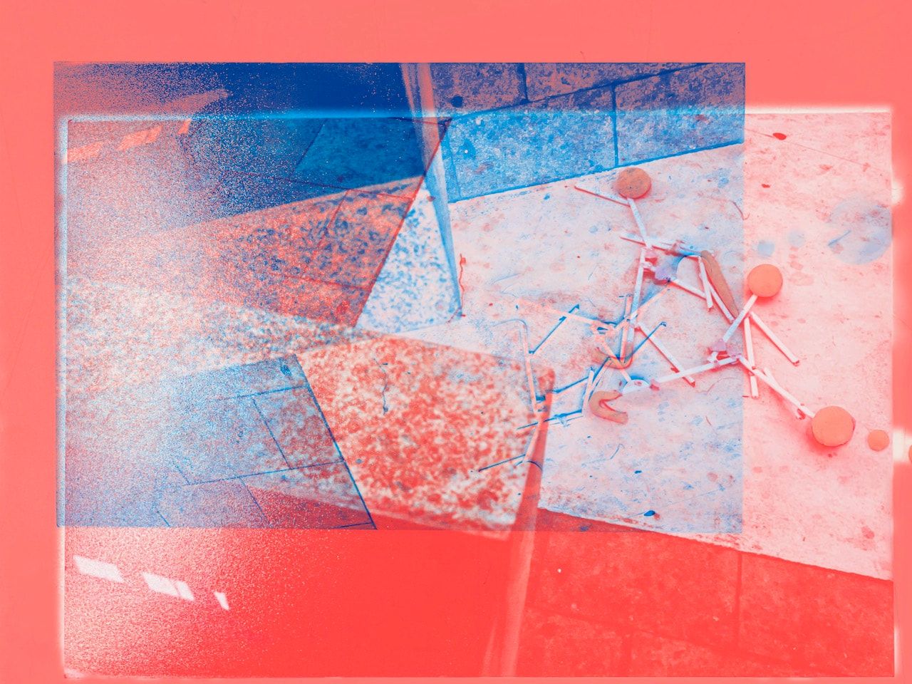
Treasure Hunt Images
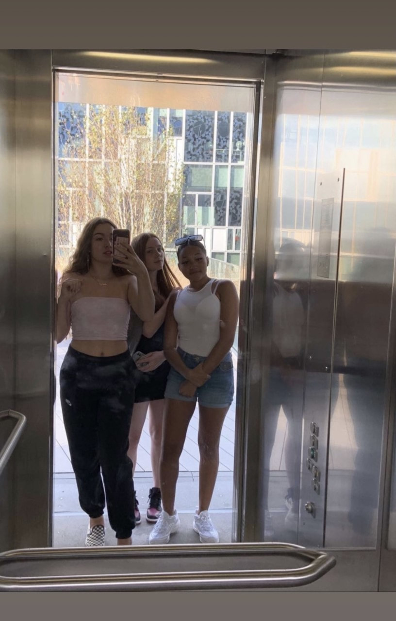

Playground
|
|
Assessment
The process...
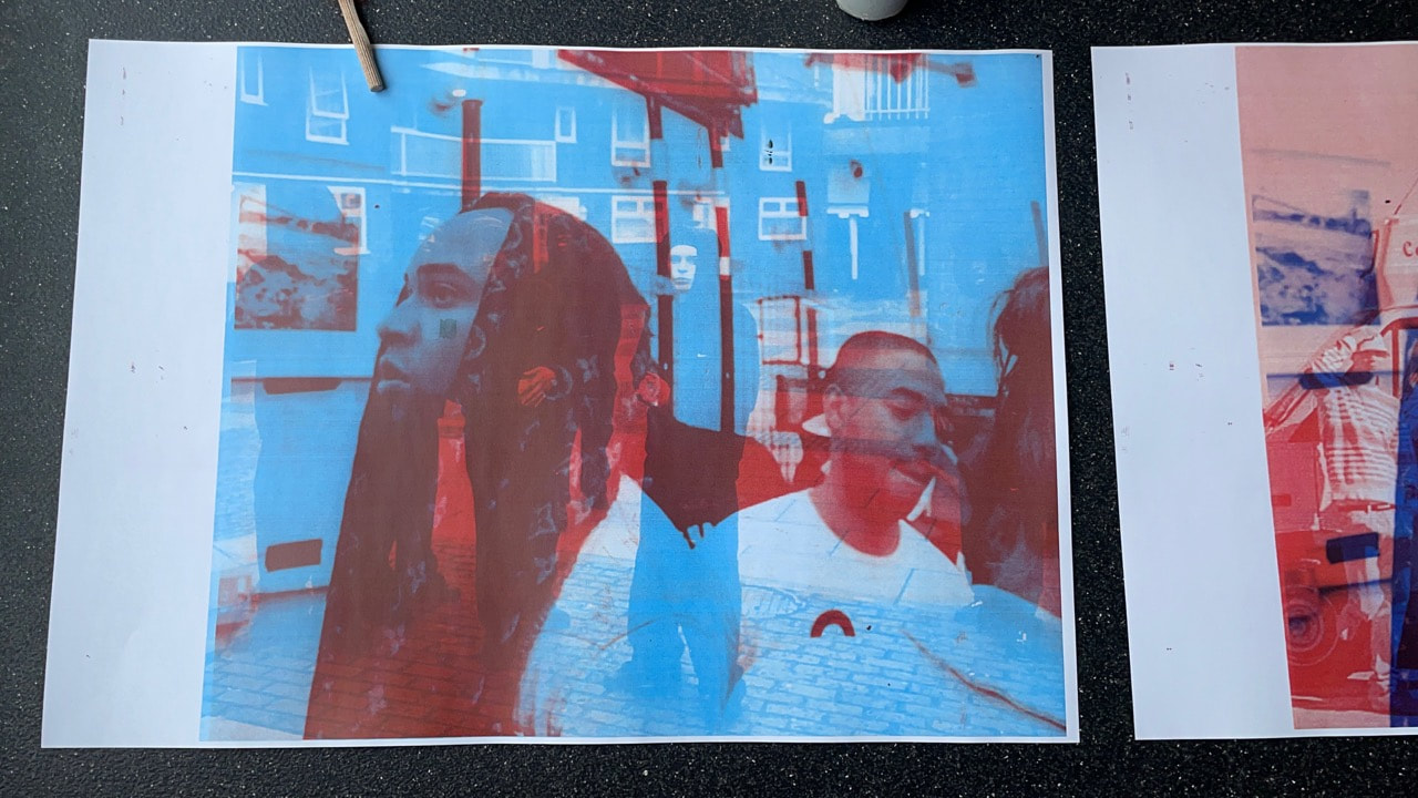
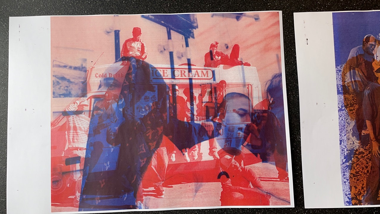
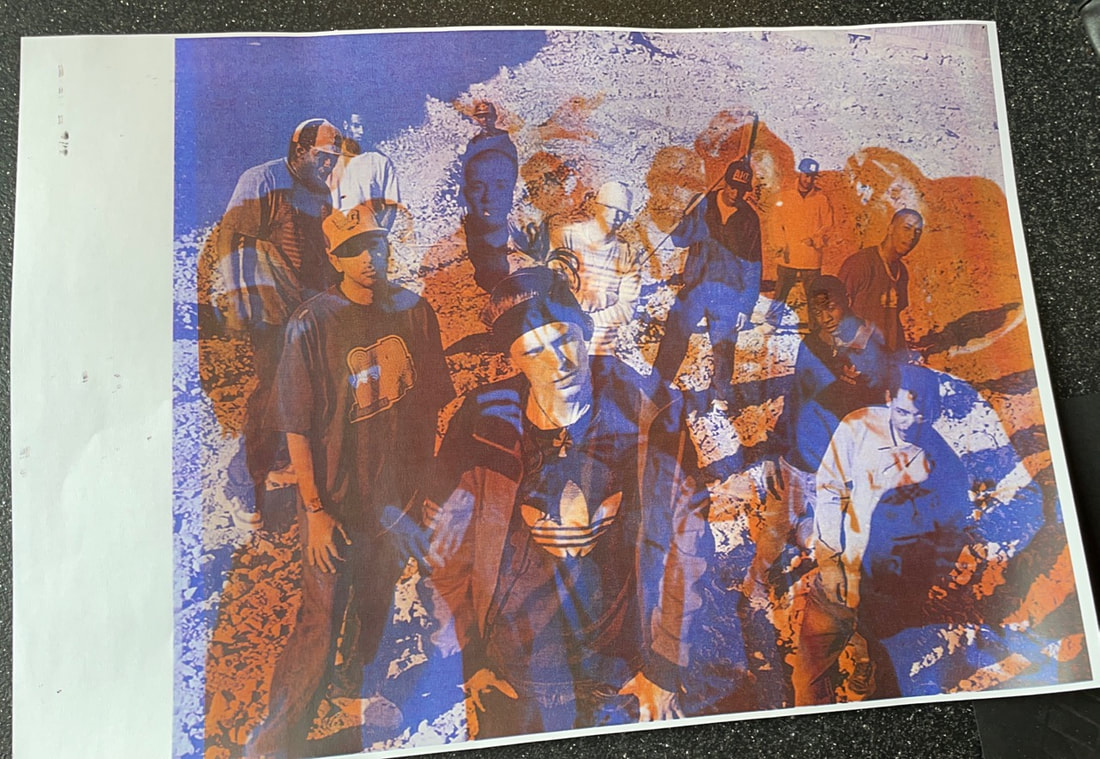
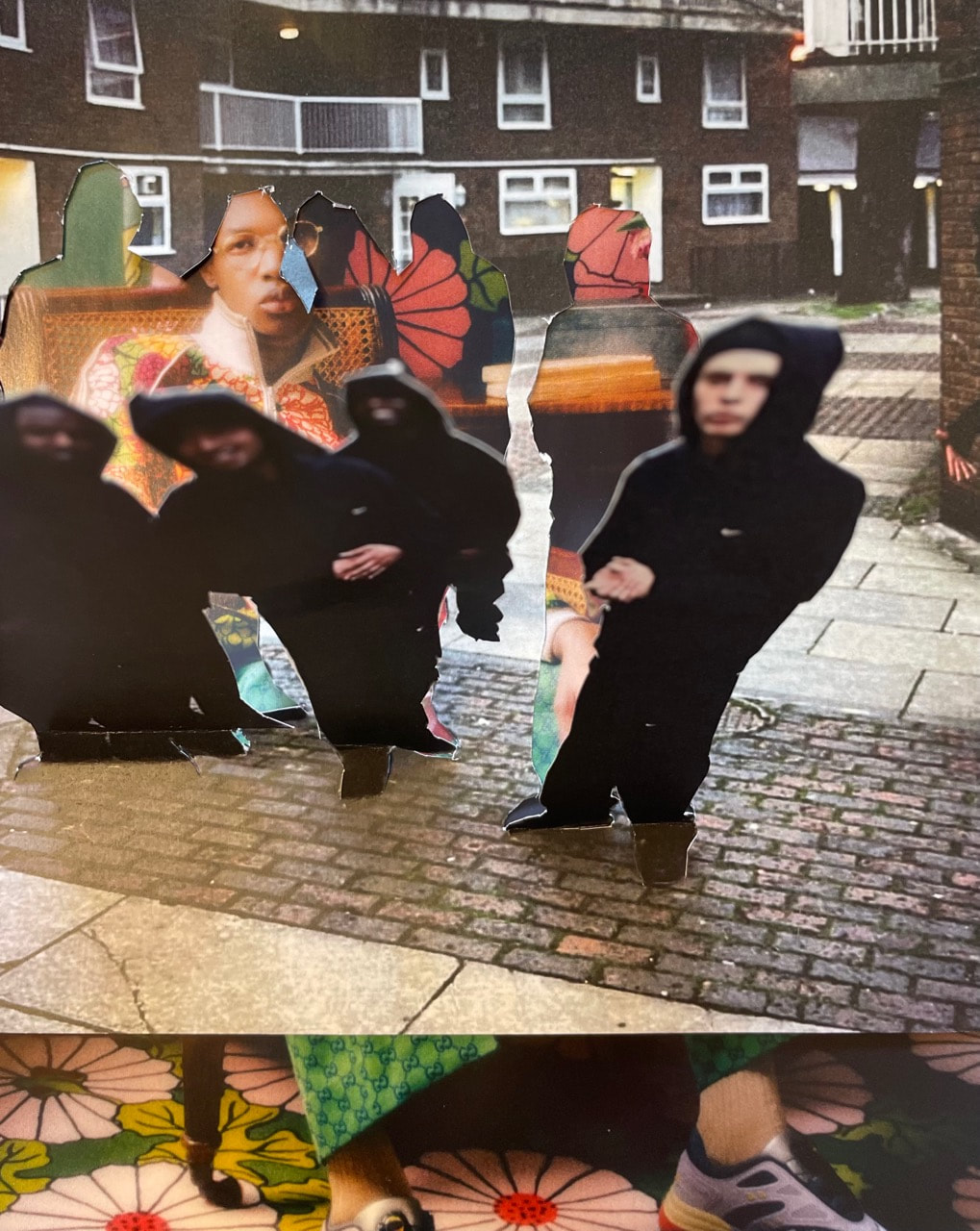
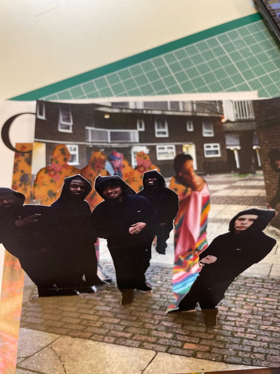
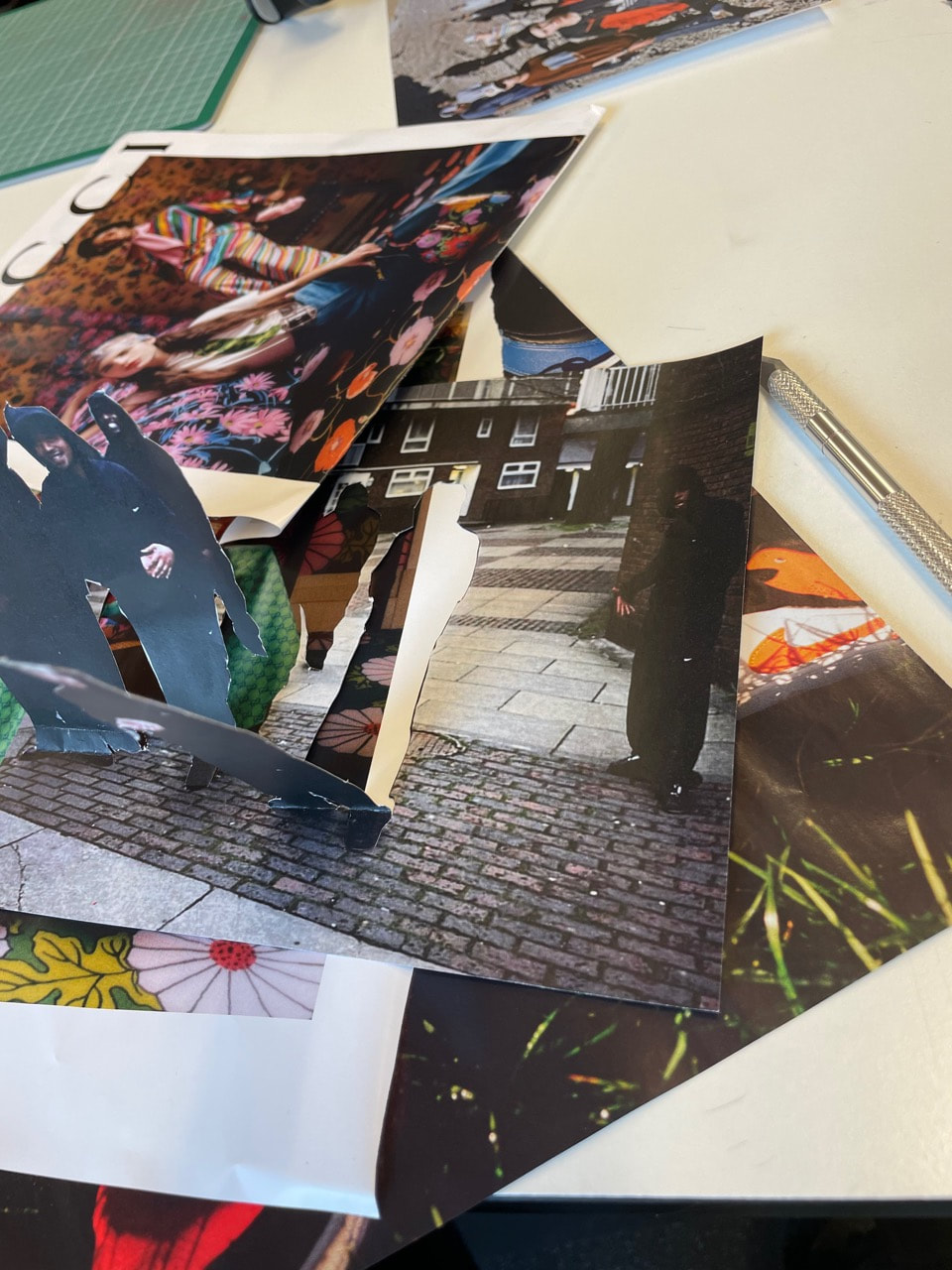
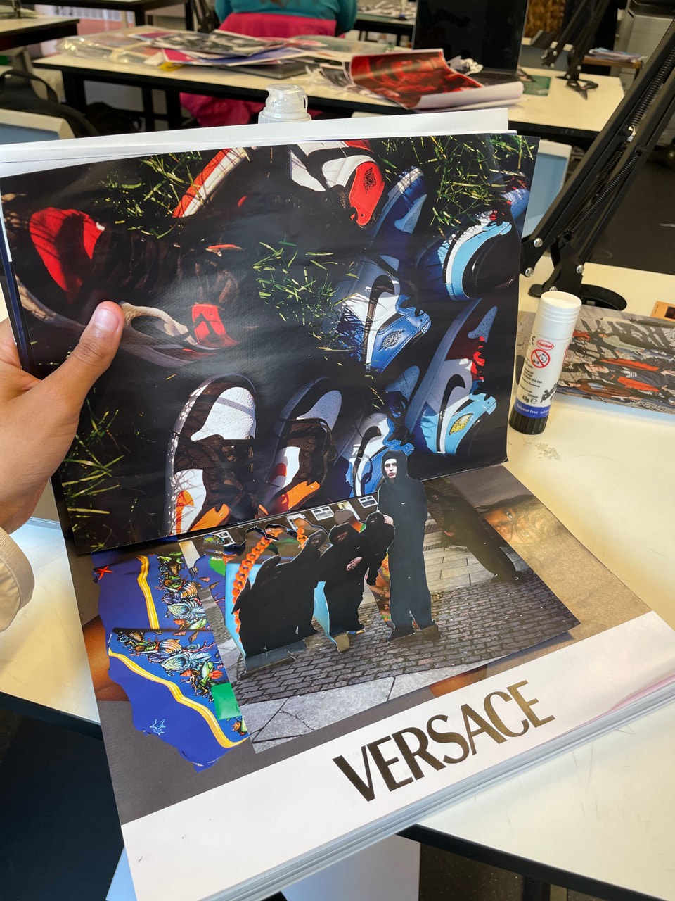
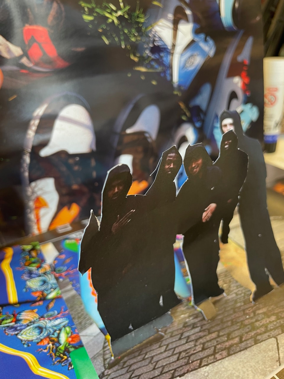
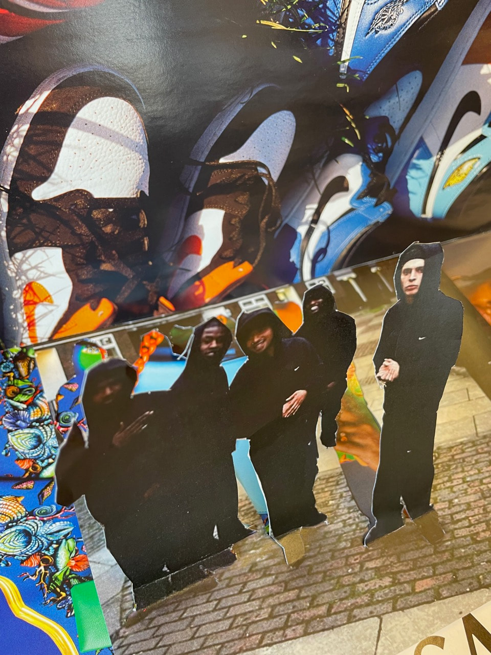
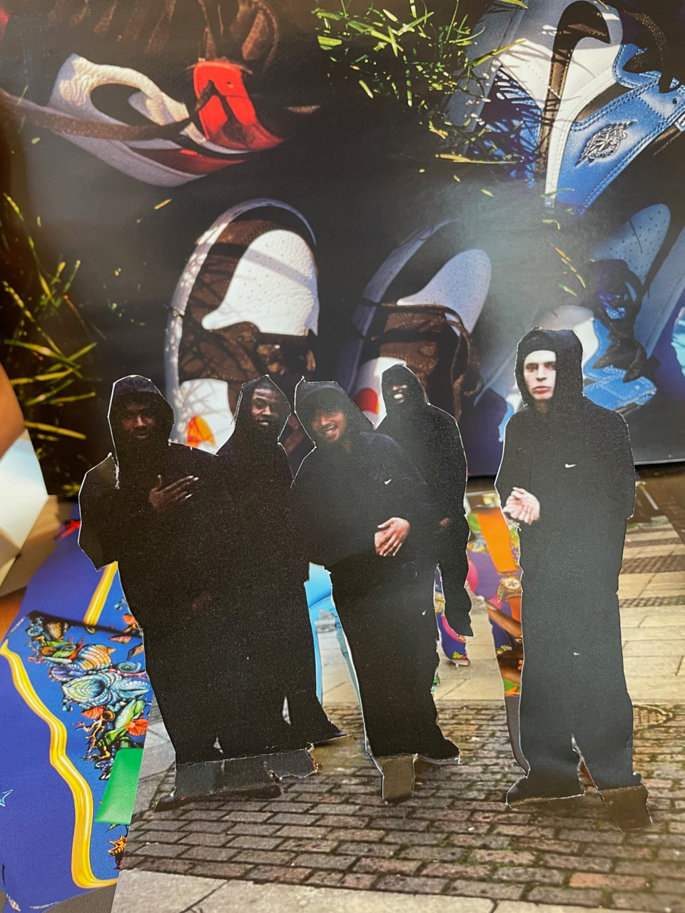
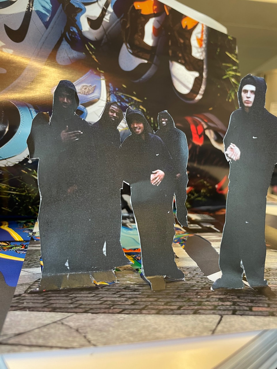
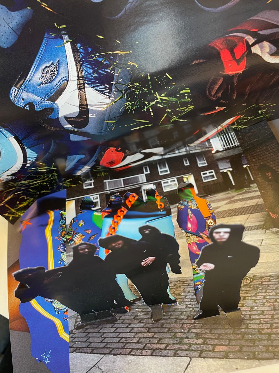
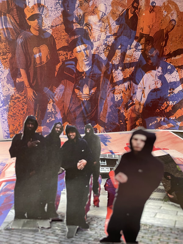
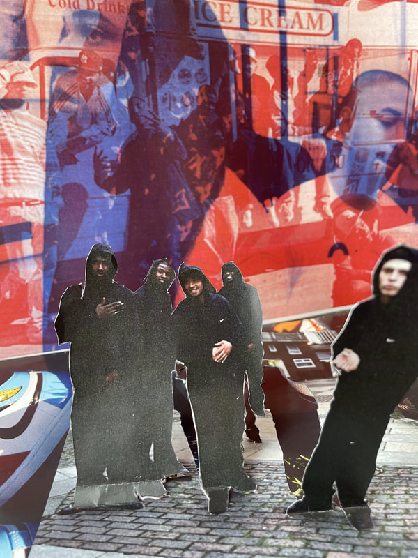
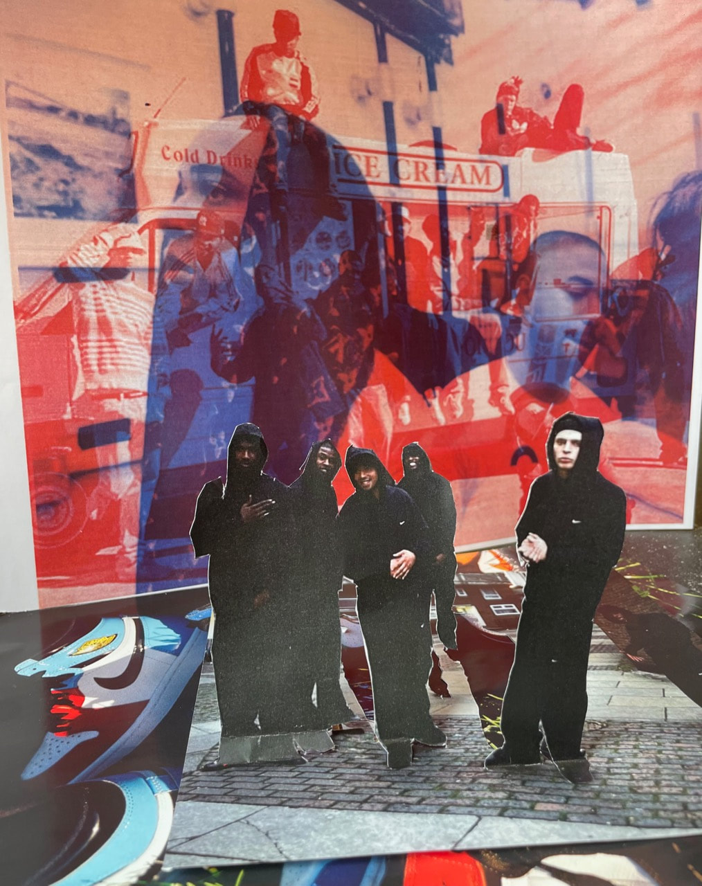
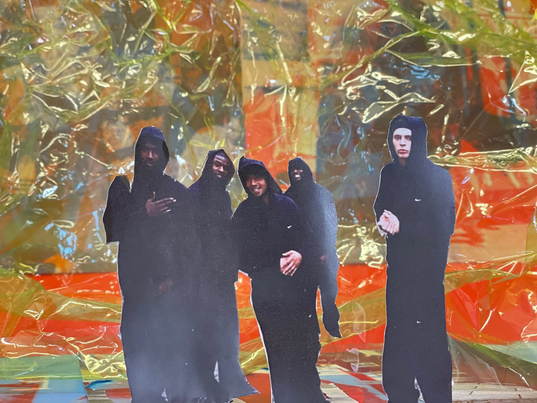
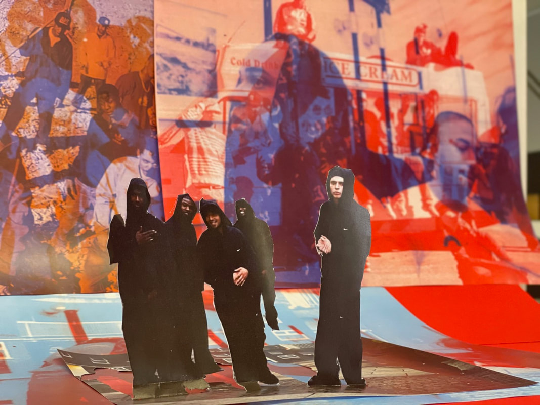
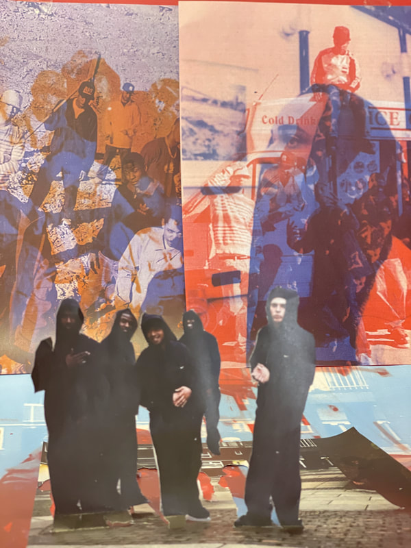
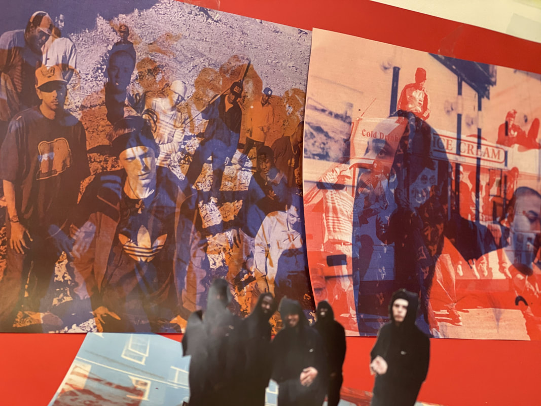
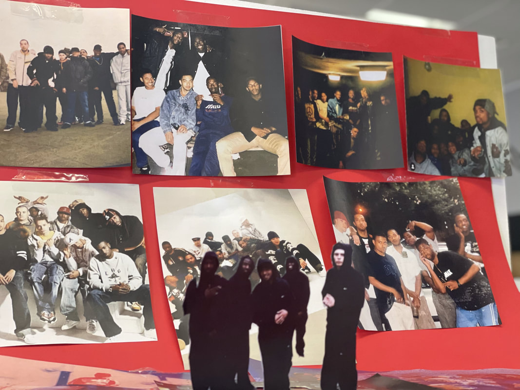
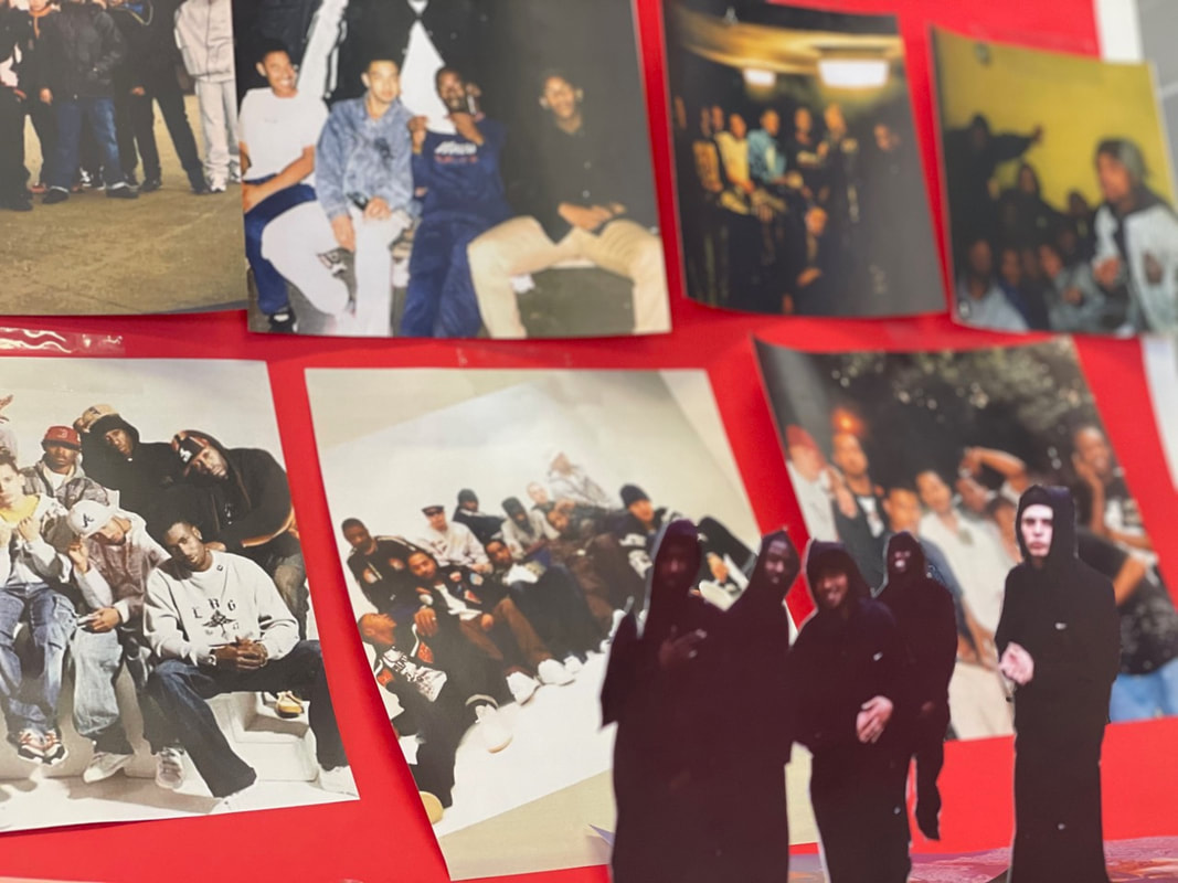
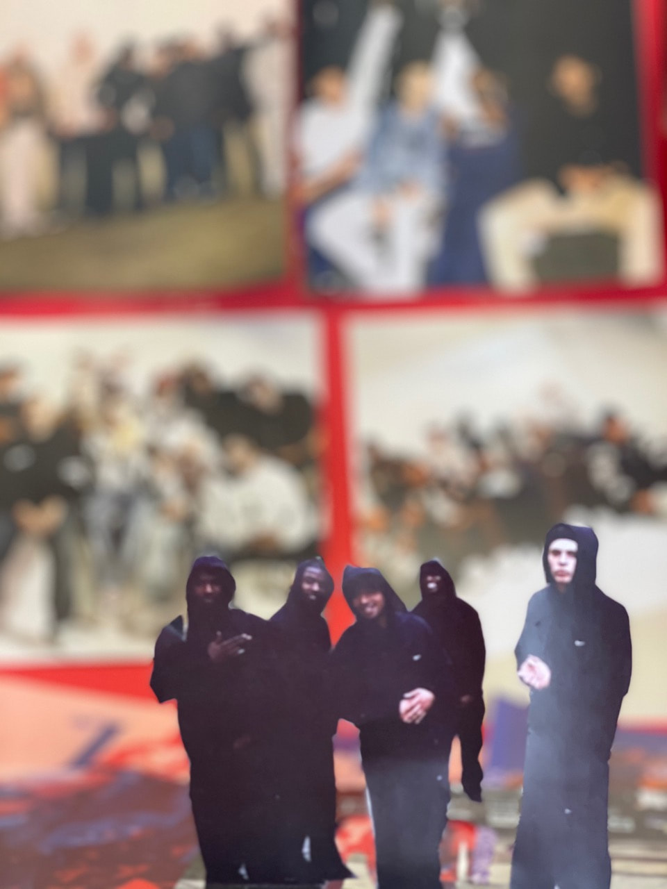
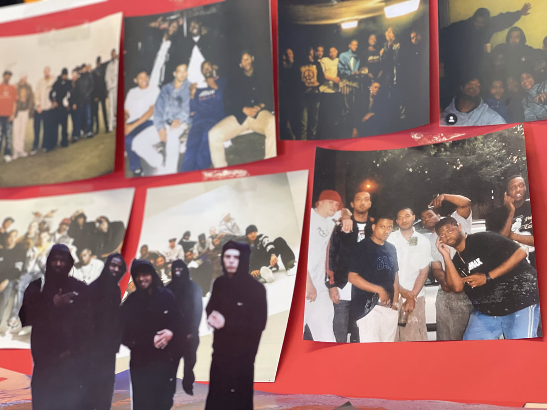
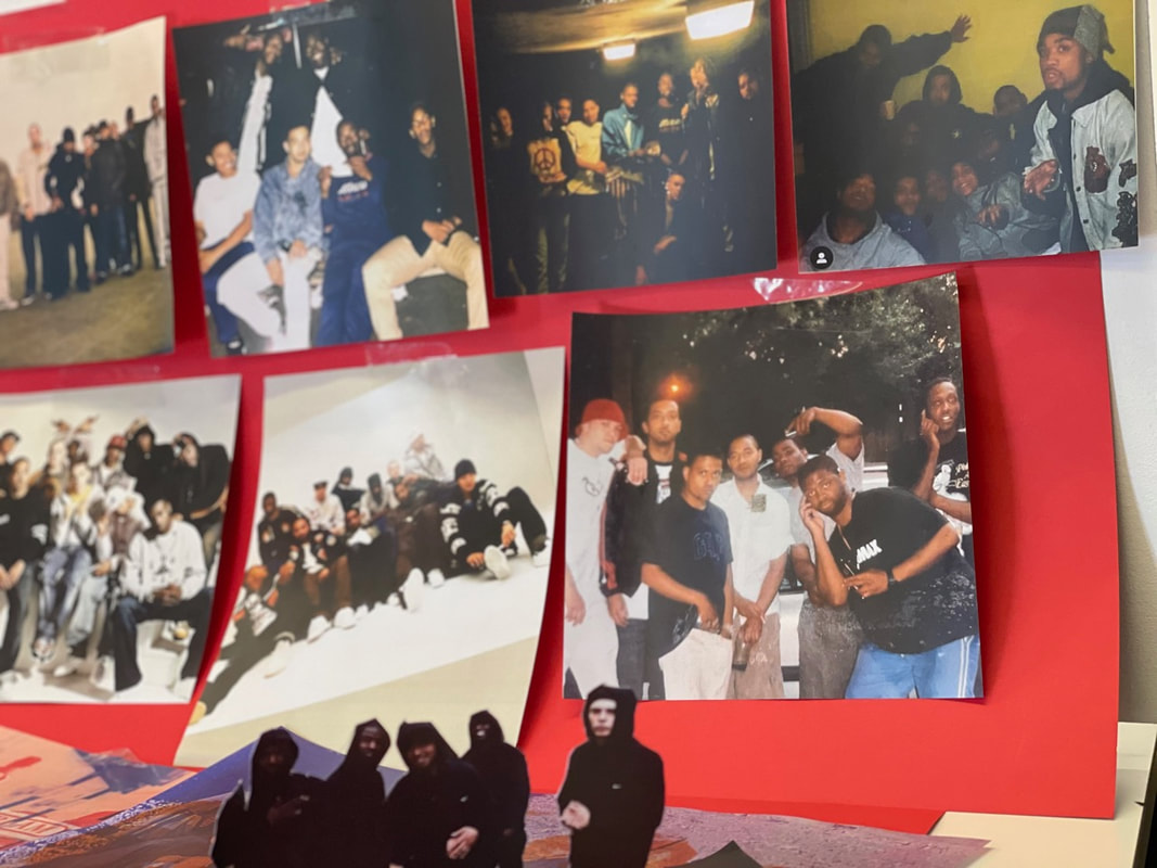
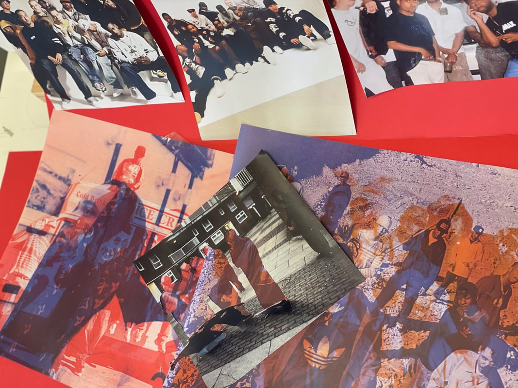
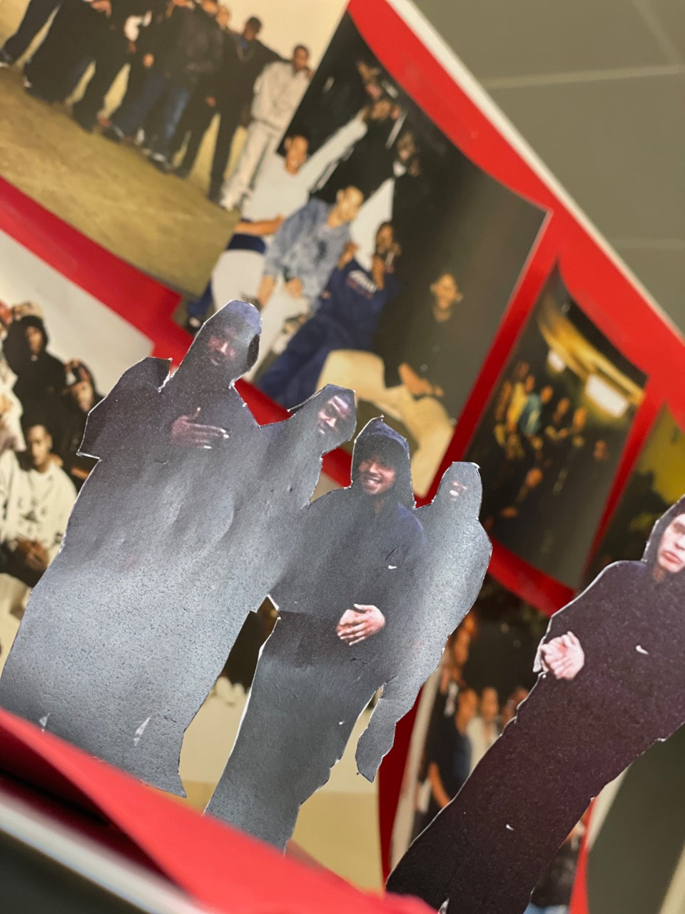
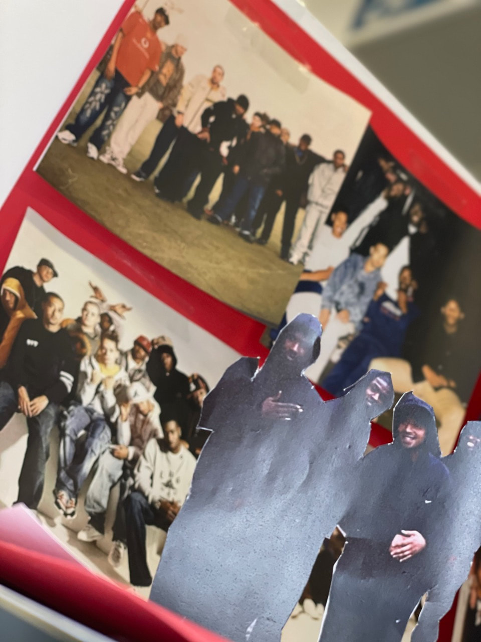
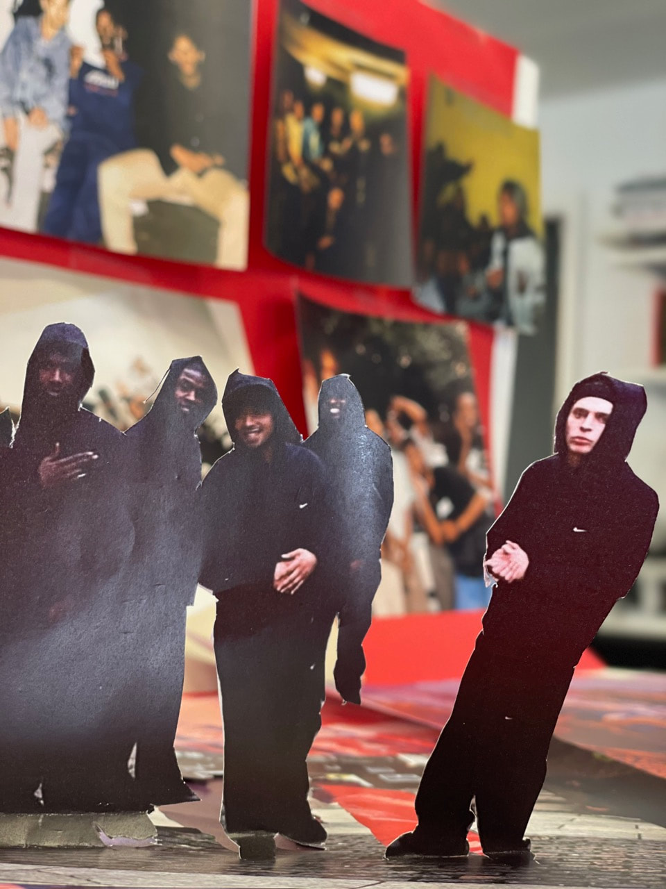
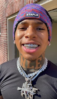
I decided to base my final project of my dad and his old band Roll Deep I chose this theme because i really liked how him and his group dressed back then and thought it would have a vast affect on my website.
- First I printed all the images i had of the group
- Then I chose to cut out the image of them in all black and that was my main image
- Then I went to the printer and scanned the images over each other in different colours and those where my backgrounds
- Then with the other images remaining I used them as a 2nd back ground for my images
- And then took the images above
Favourite Images
These 6 images are my favourite images i took because you can see everything i've done in the making day and you can clearly see my dad and his group in every picture. I chose my dad as a theme because i just loved the style , vibes and everything about how they where presented back then.